


Get Rid Of ‘Em
November 22nd, 2018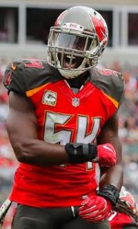
Newspaper: Throw away these uniforms.
Barring something totally unforeseen, some sort of regime change is coming at One Buc Palace very shortly after the holidays.
The Tampa Bay Times suggests Team Glazer should not stop with the coaching staff.
In an editorial this week, the paper demands Team Glazer stop assaulting our senses with the Bucs’ uniforms, as if our senses are not assaulted enough by what ownership grotesquely pays for what their coaches call a defense, which is just about as close to football pornography as one can get.
(The next time a Bucs game is broadcast in primetime, Joe has learned the FCC is prepared to send cease-and-desist letters to NFL broadcast partners for what the federal agency considers indecent content.)
It seems the paper wants Team Glazer to return to the red classics worn during the glory days of Warren Sapp, John Lynch and Derrick Brooks. The paper cited examples like the Packers, Bears and Giants, whose uniforms are both pleasing to the senses and a tribute to history.
The beauty of the Packers’, Bears’ and Giants’ uniforms is that they’re simple. They don’t need reflective chrome or blinking lights. They say Green Bay, Chicago and New York. The Bucs’ uniforms say identity crisis. That’s what happens when you “collaborate” and take a design-by-committee approach.
The paper also pleaded with Team Glazer to rid the franchise of the alarm clock fonts. It claims, in so many words, the sight of the numbers makes folks reflexively slap at a snooze bar.
Joe agrees that the classic red uniforms were good; there was no compelling reason to change them outside of a temporary spike in gear sales (which Joe, being a capitalist, understands).
The creamsicles remind Joe of the early years, not so much the losing but how glorious it was when they were winning. The red classics remind Joe of that glorious southern California evening in late January of 2003, when Chucky hoisted the Vince Lombardi Trophy aloft in victory.
The current uniforms? They remind Joe of horror movies of Garrett Gilkey snapping a ball over Stewart McClown’s head, of Mike Jenkins flopping on the ground like a freshly reeled-in snook, or some of the worst defense known to mankind.
They are both an eyesore and a trigger for PTSD with too many Bucs fans.


November 22nd, 2018 at 12:13 am
Totally agree that the new uniforms are fugly and hideous.
Bucs should go back to a moderately tweeked version of the Superbowl red and pewter
November 22nd, 2018 at 12:17 am
I’d watch every game if they went back to the orange, yes even with Dirk still here. Still somewhat angry we cant get one game a year. Find a way to change the helmet logos to make it happen Glazers. We know money isnt the issue. And to me red is red. If its not the original they all look the same, which is way worse than the creamsicles.
November 22nd, 2018 at 12:25 am
it’s time. Maybe it’s the uni’s? ..or whatever we suck …again
November 22nd, 2018 at 12:29 am
Finally a movement I can get behind!
I haven’t like the uniforms since Day 1 and always thought it was a head scratcher. And even though I’m a homer Bucs fan I think the 2000’s red unis were among the best looking in the NFL. Personally I love the Dolphins unis and the Chargers light blue alternates as well, but the current Bucs uniforms are without a doubt the worst in the NFL even worse than the Seahawks and Jags.
Bad uniforms for a bad team I guess.
November 22nd, 2018 at 12:33 am
What would be terrific would be if the NFL went to a soccer-style attitude with uniforms. There is, for example, no reason that one team should (usually) be mandated to wear white; that is a vestige of the black-and-white television era. I remember thinking during the Bucs-Dolphins game in 2000 how much better the game would look if the Dolphins wore their aquamarine jerseys, while the Bucs wore the red and pewter they donned that soggy-yet-superb afternoon.
Thus, the primary uniform should be red and pewter. And since in soccer, the alternate uniform often has different colors than the regular team colors, the secondary uniform should be orange and white — in both cases, updated versions of the 1997-2013 and 1976-1996 classics, respectively. If the league continues to mandate only using one helmet shell a season, both uniforms can be worn with pewter helmets; if the NFL relaxes its standards, then the orange alternates could have the original 1976-96 helmet logo and stripes. For a couple of games a year (say, September 1 p.m. kickoffs at home), the Bucs can have a white third jersey.
Thus, both eras of the past are saluted and carried forward, and the current uniforms are relegated to the Superfund of history where they belong.
November 22nd, 2018 at 12:52 am
The current uniforms only add to the joke that this team is. They’re worse than the creamsicles. The creamsicles were fine for the era (the trendy 70s and 80s)
November 22nd, 2018 at 1:32 am
Kinda weird the paper of record doesn’t know the NFL requires the Bucs to have orange in their scheme *somewhere*.
November 22nd, 2018 at 1:45 am
I saw 54 and thought this was an editorial about why the Bucs should go Tampa Rays and part ways with some of their marquee names, aka as over rated deadwood and was expecting mentions of tossing DJax or GMC first but yeah the uniforms are below average, right up with those neon Seahawk uniforms a few years back, the Astros in the ’70s and suits worn by Craig Sager (RIP), Don Cherry and the ultimate cheapskate with his tangerine leisure suit; Hugh Culverhouse!
November 22nd, 2018 at 2:17 am
If anyone in the Bucs organization actually reads these articles, please change these. These uniforms have looked ridiculous from the start and it’s time to simplify. Make some minor updates to the old Reds and keep the new logo if you want. But stop making our already hard to watch team look like clowns compared to beautiful NFL jerseys
November 22nd, 2018 at 3:29 am
ok i’m glad this is finally talked about…joe i spoke to you about this a few weeks back…i’m glad you brought it up because it must be discussed…
the new uniforms have never translated to winning on any level and represent losing, confusion, and lack a pleasant streamlined look…as a bucs fan they were difficult to digest upon introduction, and it took time to eventually accept them – but never was i like “yeah i can dig this”…from an artistic standpoint, they just don’t really work…they never did…and i have ceased in purchasing team merchandise since the change over…i only have older logo gear – and i have quite a collection – yet none of the new digital stuff…
i am an artist an know wtf i am doing on some levels, i hope…lol…if the glazers or their art department need some help, just reach out for assistance – i can help you mofos to get this dialed up and correct…
ok as for the jerseys:
i would go back to the look of the superbowl champs…the ones sapp and them wore…pewter pants are the move…white pants as the alternate…do not ever think of doing red pants…red jerseys and white jerseys are cool, and i would add in a pewter jersey as well…that would be hot…for a nice all pewter streamlined look – and i would loose that eyesore of an all red color rush uniform – just switch it to a bad azz all pewter color rush uniform…it’s a nasty and hot look…
as for tweaks, i would keep the new pirate flag logo – do not go back to the old one, and maybe play with an orange stripe on the pewter pants, so to pay homage to yesteryear…
also updating the pewter to an almost black color was a really bad move…go back to the old original pewter…it was rare and distinctive – and if you did a color rush jersey in that color with red numbers and an orange pants stripe of some sort – it would look sick af
also try to bring back the throwback orange game and gear once a year – if goodell will have it…
if you need help glazers, hollar at ya boy!…i got this…trust me, if there’s one think i know it’s sheet like this…
we had some of the best unis in the league during the sapp and alstott era – don’t be fooled – opponents fears the bucs and their unis – it can be psychological…
these new unis are a joke and everyone knows it…they translate to a 10 dollar alarm clock at walmart…let’s get it together and uni up!
November 22nd, 2018 at 3:34 am
please excuse those typos…joe and the glazers
November 22nd, 2018 at 5:53 am
The uniforms suck….The original orange uniforms were unique and the best by far….Going back to those with maybe some modern modifications would be cool….I don’t identify with those as losing like some of you…People forget that McKay made the playoffs 3 times in 4 years, 2 division titles, and was one game away from the Super Bowl with a 4 year old expansion team. Winners! At the very least they should somehow bring back a throwback game every year. Stupid helmet rule sucks!
November 22nd, 2018 at 5:56 am
There the Glazier kids soccer uniforms. Trying to be stylish. The uni’s, like everything else with this organization suck. Bucco Bruce Uni’s were way better. What happens when you let spoiled soccer kids make choices.
November 22nd, 2018 at 6:11 am
I got used to the jerseys except for the numbers. The digits look ugly as hell. But, the other parts of it are alright. Maybe get rid of the black shoulder portion and just make it all red with the orange triangles in place.
I think classic numbers would make a huge difference in the overall look. It looks too wannabe futuristic for no real reason.
And while we’re at it, the Cheerleaders uniforms need to go back to the Super Bowl days with the pirate skirts and knotted tops. Their uni change is the real travesty here. Yoga pants? Really? There’s the real identity crisis.
November 22nd, 2018 at 6:14 am
Umm, I’ll puke if I see those creamsicle pansy colors on the players. Seriously, color psychology is real. No one is intimidated by creamsicle.
Hard pass on those fugly uniforms – the days of deja vu where we were one of the worst organizations in the league. No thanks.
November 22nd, 2018 at 7:39 am
Lose the pewter pants and the digital clock numbers and they’re good. Pewter should be an accent color at best. I like the helmets and the all whites or reds jerseys with white pants are good.
November 22nd, 2018 at 7:56 am
Bring back the red and pewter. If they want a throwback game the original colors using the new helmet and old Bucs Logo can’t be that big of a problem for safety.. But get rid of this UGLY GARBAGE we are looking at now.
November 22nd, 2018 at 8:28 am
Only 25 wins total in almost 5 years in these current unis! Burn them after this season. Give us a fresh new regime as well as unis! Modify the Super Bowl jerseys! But why would Team Glazer do that? They signed off on f@cked up Management and coaching as well as our current unis! It’s a Bucs life!
November 22nd, 2018 at 8:34 am
Where is the petition??? Totally agree.
November 22nd, 2018 at 8:42 am
When the new uniforms came out 227 years ago, I thought maybe my visceral hatred of the design was just because I was becoming crotchety-before-my-time and adverse to change. But nope. I still hate them. It could be worse…it could be the Lions’ grey uniforms. Those make me avoid eye contact with the television out of sympathetic-embarrassment.
November 22nd, 2018 at 9:02 am
The vibrant red in that newer jersey is cool as hell, and the orange pinstripe along the edge has really grown on me too, paying homage to the vintage uniforms.
But yes….. something needs to be altered somewhere.
ESPECIALLY… the numbers.
Change them to something more pirate-like, instead of alarm clock like.
November 22nd, 2018 at 9:06 am
Joe Blahak Says:
“The original orange uniforms were unique……….Going back to those with maybe some modern modifications would be cool….”
~~~~~~~~~~~~~~~~~
The more I think about it,,, you just might be right, Joe. — Maybe it really would kick ass to go back those,,, but with the updated helmet logo.
November 22nd, 2018 at 9:07 am
It’s just the font. The chrome aspect is fine. Whatever. But the font for numbers is dumb. What about that screamed “pirate” to anyone? More screams “It’s a Bucs life” to me.
November 22nd, 2018 at 9:10 am
They went red if I remember correctly because majority thought the creamsicles were hideous. At the time they were right. They’re still right. Those orange uniforms were just as ugly as the new ones. That fairy pirate and all.
Love the creams cause I’m a nostalgic type person, but don’t bring those back please.
November 22nd, 2018 at 9:45 am
I for one could go with a black and red uniform with pewter highlights.mostly black (75% and red 20% and pewter 5%.)
November 22nd, 2018 at 9:47 am
^^^ @El_Buc941
Hmmmm… what about EXACTLY what you just said, but with 5% orange highlights instead of pewter?
November 22nd, 2018 at 10:03 am
The classic pewter and red. Everyone loved those. By far the best uniforms in sports, not just football. Please bring’em back!!
November 22nd, 2018 at 10:09 am
Lamborghini with bumper stickers, why????
November 22nd, 2018 at 11:24 am
Pewter as in cannonballs as in pirate ship. More pewter and red. Less Burger King and alarm clocks.
November 22nd, 2018 at 11:38 am
Please bring back the pewter jersey they were the best in the league
November 22nd, 2018 at 11:45 am
Bring back the classic pewter and red. It meant something.
The current uni’s look like an alarm clock in the “color and style” abortion ward.
November 22nd, 2018 at 11:45 am
The current helmets are nice, though…
November 22nd, 2018 at 11:50 am
^^ agreed, Cobraboy, with the larger logo.
November 22nd, 2018 at 11:51 am
The uniforms are ugly and so is the helmet flag way too large. Who picked these out Mister Magoo?
November 22nd, 2018 at 12:29 pm
New gm, new coaches, new players, new uniforms….how about new owners?
November 22nd, 2018 at 1:04 pm
Let’s go back to the Originals, and the Orange pants! These Uniforms, were the Best Ever!!!!!!!
November 22nd, 2018 at 2:49 pm
Orange and pewter. Falcons are red already.
November 22nd, 2018 at 3:20 pm
I’m with Mark. Red is everywhere! We were Orange! (the new pink! 😉 Burnt Orange where the red was on the previous uniforms. Burnt Orange looks great on the college teams.
Yes, the numbers should have remained an idea, only!
November 22nd, 2018 at 3:40 pm
I want the creamsicle orange!!! Rust/burnt orange would be nice also…
November 22nd, 2018 at 4:08 pm
Bleed red. Crap pewter.
Go back to the previous uniforms.
Or let me design new ones. Guarantee I can come up with one everyone will like.
November 22nd, 2018 at 6:32 pm
Just change the font, that’s the only problem, it doesn’t go with feel of the jerseys
November 22nd, 2018 at 6:46 pm
The weirdest part is Nike’s decision of a “matte pewter” for the pants (& shoulders). No, Nike, now they just look brown or black and don’t match the glimmering helmet. Nike took the one aspect of the color scheme that was unique and made it as dead as possible.
November 22nd, 2018 at 7:12 pm
There’s a reason no other team in the history of sports has “matte pewter” as one of its colors.
November 22nd, 2018 at 9:10 pm
Our uniform is a collection of Nike rejected ideas all in one overdone mess.
I picture the execs at Nike giggling when the Glazers signed off on this idea.
They have been skewered for 4 years about this fashion disasta.
Gotta go!!!
November 22nd, 2018 at 10:13 pm
Crazy thing is so many people have bought these new uni’s and they know they are ugly as hell. GO BACK TO THE CLASSIC REDS AND I’M SPENDING $275 (OR WHATEVER THEY COST) ON AN AUTHENTIC OJ HOWARD TOMORROW GLAZERS!!! I think the lines in the numbers is what makes them SO MUCH WORSE! The numbers would look so much better and the jersey in general would also. I remember a few years ago of a prototype uni that was all pewter and had some red. Looked bad a$$. My boss has an authentic pewter Jameis jersey and it looks bad a$$ as much as it can be.
November 22nd, 2018 at 11:15 pm
Hated it.
November 23rd, 2018 at 1:32 am
About damn time someone printed this in newspaper ink.!