


Your New (Old) Bucs Unis
April 7th, 2020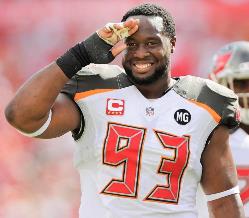
Farewell alarm clock fonts, and a salute to the Bucs for the new/old jerseys.
All Joe can say is, “Bravo, Bucs. Bravo!”
Common sense (finally?) overcame the shot-callers at One Buc Palace and the team reverted to the classic Bucs uniforms from the Super Bowl-winning era, debuted today.
The home red with the pewter pants is nearly identical to what the Bucs wore when they ruled the NFC South (and previously, NFC Central).
Now the Bucs also debuted same-color uniforms, pants and jerseys that Joe guesses are alternative get-ups.
Joe is fundamentally against wearing pants that are identical to the jersey. That goes all the way back to high school for Joe when Joe’s school would play teams that couldn’t afford a second set-up of pants. Therefore, that look has always appeared to be low-rent for Joe.
However, if alternate uniforms are what it took in a trade to get back to the classics, so be it.
Thank you Bucs for seeing the light. Thank you.
And those alarm clock-font jerseys? They will henceforth be known in Joe’s mind as the Jameis Winston jerseys, as those things were in their second year when Jameis was drafted and were thrown into the trash when Jameis was shoved out the door.
Allow us to show you the future ?#GoBucs pic.twitter.com/naURTtwkZ3
— Tampa Bay Buccaneers (@Buccaneers) April 7, 2020


April 7th, 2020 at 1:08 pm
THANK GOD
April 7th, 2020 at 1:09 pm
Much better.
April 7th, 2020 at 1:09 pm
Damn skippy. Great job Glazers….
April 7th, 2020 at 1:09 pm
Love all three but especially the all pewters!
April 7th, 2020 at 1:10 pm
I’d love to see what the pewter jersey looks like with the white pants. They’ve basically got six different uniform combos they can use now.
April 7th, 2020 at 1:10 pm
that alternate jersey is fantastic!!!
April 7th, 2020 at 1:10 pm
Same old. I’ll just wear my old McCoy jersey. Other than the 3rd pewter style nothing new to see here. But I agree waaaay better than the Winston era uni’s.
April 7th, 2020 at 1:10 pm
Love it
April 7th, 2020 at 1:12 pm
I’ll shimmer against that pewter jersey!
April 7th, 2020 at 1:12 pm
Hell right!!
April 7th, 2020 at 1:12 pm
HELL YEAH!!! SUPER BOWL CHAMPS TAMPA 2021!!!
April 7th, 2020 at 1:13 pm
They’ll look sharp when the NFL plays again…fall of 2021.
April 7th, 2020 at 1:13 pm
They used #45 #54 and #14. so we know what the #4, #5 and #1 looks like. Should have used different players with different numbers. Pewter jerseys rock.
April 7th, 2020 at 1:13 pm
Was that music MC Candy Wrapper or Mc Young Feces?????? It’s confusing cause they all sound the same!!!!!!!!!!
go bucs!!!!!!!!!!!!
April 7th, 2020 at 1:13 pm
Without the alarm clock, I sort of slept through the video……watched it again and like the new unis……..
April 7th, 2020 at 1:14 pm
Love the pewter
April 7th, 2020 at 1:14 pm
Any uniform with out JW in it looks awesome
April 7th, 2020 at 1:16 pm
I like it! Back to what it always should have been.
April 7th, 2020 at 1:17 pm
Back to the Future
April 7th, 2020 at 1:17 pm
That’s grey not pewter and I’ve always wanted to put in some grey for a since of dark clouds. Didn’t get much of a look at the helments. Have they changed to a grayer color also?
April 7th, 2020 at 1:17 pm
Much love!!!
April 7th, 2020 at 1:17 pm
My BEST birthday gift EVER !!!
April 7th, 2020 at 1:18 pm
yawn!
April 7th, 2020 at 1:18 pm
I like the uniforms, and a much needed improvement. The Pewter Pirates are back! I wish that they would consider burnt orange for the home jerseys. That would distinguish the team from other teams that have adopted red (e.g., Atlanta and SF) and be a nod to the original uniform.
April 7th, 2020 at 1:19 pm
These are sooo dope! Thank God the alarm clock abomination is gone. Can’t wait to see our rookie class and order up one of those Pewter color rush jobs!!!
April 7th, 2020 at 1:19 pm
those grey jerseys are very meh.
April 7th, 2020 at 1:21 pm
When the Paul Lukas (Uniwatch) leaks came out weeks ago, I was really disappointed that it seemed that the orange accents were axed. So glad the leaks were wrong! Orange accents alive and well on these unis as they should be!
April 7th, 2020 at 1:21 pm
I would have liked a little more orange in there, as I always thought that color looked good with the pewter (plus the red and black sans orange look a little to close to what the Falcons away jerseys look like), BUT that’s splitting hairs. Overall the “back to the future” uniforms certainly look better than the “Burger King” uniforms they are replacing.
April 7th, 2020 at 1:22 pm
Can some tell the bucs that this is the NFL not the nba!!!!!!!! enough with the crap music errrrr I mean rap music!!!!!!!!!!!!!
go bucs!!!!!!!!!!
April 7th, 2020 at 1:22 pm
Love them, especially the all black one.
April 7th, 2020 at 1:23 pm
So they’re exactly like what was predicted. I was hoping for a small surprise I would like. Anyways love them! Tampaaaaaa
April 7th, 2020 at 1:23 pm
SOE Buc – your helmet question . . . from the team’s website: ” The side of the flag on the helmet has been reduced to ensure the sword is visible on all helmet types used by players.”
April 7th, 2020 at 1:24 pm
they pretty much nailed it…
i would have stayed triple layer numbers on the all pewters…
with the in between layer being the same pewter color…
or potentially the orange colr tucked between the red and white…
either way, the unis are hot!…
good job bucs…
i score this a 9 out of 10…
we might be back to the best unis in the league again…
i haven’t gotten a jersey in many years…now time to add in an authentic pewter one…
these pewter color rush uniforms are wicked good 🙂 🙂 🙂
April 7th, 2020 at 1:24 pm
I’ll just consider myself out of touch and refrain from complaints about that video.
The grey ones looked pretty sharp.
April 7th, 2020 at 1:26 pm
Good.
April 7th, 2020 at 1:26 pm
The all Pewter’s look so 21st century!!!!
April 7th, 2020 at 1:27 pm
Seriously, who selects the music over there?
April 7th, 2020 at 1:27 pm
the video for the unis is weird and lame…and childish, with rap and all…but what can you do during covid19…
it’s all good tho…
everyone must stay safe and healthy…and a video pretty much keeps it right there
#FuggCovid19
April 7th, 2020 at 1:27 pm
Goodbye JayMiss Winston Uniforms!.Love them and the keeping of the Helmet w black face mask
April 7th, 2020 at 1:27 pm
I guess Godwin knew his number was 14 from the beginning . . .
April 7th, 2020 at 1:27 pm
Why is Godwin wearing Brady’s number?
April 7th, 2020 at 1:29 pm
Now I can order a #14. Our long days of embarrassment are ending…hopefully our play improves as much as the unis.
It did seem like the three guys felt good in those unis.
And yeah I agree with Joe that those old unis will always remind us of JW.
This is one place I do agree with the JW lovers. Those old unis didn’t do JW any favor..hard to have and swag in those old embarrassing unis.
April 7th, 2020 at 1:30 pm
Well here’s my honest opinion. I think they are not as lively as our super bowl uniforms were…I feel they look nicer though then our radio clock numbered uniforms. I still like the updated very modern example of the creamsicle uniforms shown online several weeks ago. I like the pewter jerseys the best of what we have now.
April 7th, 2020 at 1:30 pm
Looks like the helmets are back to peweterish vs. the chrome look.
April 7th, 2020 at 1:30 pm
@Mrs. Entertainment,
He’s 12 in the video.
I wouldn’t order a 14 Godwin cuz I’m sure he’ll switch back to 12 once Brady is retired.
April 7th, 2020 at 1:31 pm
Goodbye JayMiss Winston Uniforms!.Love them and the keeping of the Helmet w old black face mask
April 7th, 2020 at 1:31 pm
Should have gone back to the Orange Uniforms, would have been way better!!!!
April 7th, 2020 at 1:33 pm
I’m just glad the creamsicle #12 still belongs to Doug Williams and Trent Dilfer and not Tom Brady, let’s win
April 7th, 2020 at 1:33 pm
YESSSSSSSSS.
A MILLION TIMES YESSSSSS.
UNIES we can be frikking PROUD OF again.
Now LET’S GO BUCS!!!!!
April 7th, 2020 at 1:35 pm
The Bucs nailed it.
I really don’t get why some people want full time creamsickle uniforms. I love the creamsickle if the NFL was willing to let us wear them as alternates like they used to but full time? No way.
April 7th, 2020 at 1:35 pm
yessssssssss
April 7th, 2020 at 1:36 pm
Liked all 3.
1000% better by just getting rid of the alarm clock numbers…
Now go get your number 12 Brady jersey.
April 7th, 2020 at 1:37 pm
that alternate jersey is fantastic!!! Love them all, so glad to have anything different. Jersey sales will be up with Brady obviously, back in the day we used to be high up annually in teams sales.
April 7th, 2020 at 1:37 pm
lambchop:
godwin will never ever switch back to number 12 once brady leaves…
that is 100% incorrect thinking…
please learn how to think correctly…
he will remain #14 for his time with the bucs
April 7th, 2020 at 1:37 pm
They look great! Now let’s win some damn games!
April 7th, 2020 at 1:38 pm
Creamsickle #12= Doug Williams
SB Uniforms #12= Luke McCown
Alarm Clock #12= Josh Mccown
New Uniform #12= Tom Brady
The Bucs basically just combined the SB uniforms with the new logo and it’s a great combo. But the uniforms will only have value if the Bucs win.
April 7th, 2020 at 1:38 pm
Leaps and bounds better. Some day we’ll be bold enough to bring back more orange, but I’m now good for the Brady Bucs. Let’s roll.
April 7th, 2020 at 1:40 pm
Boring! Besides the Pewter 3rd jersey, what’s the big deal? Just more money to spend on the same jersey’s we purchased years ago. HUGE LET DOWN!!!!
April 7th, 2020 at 1:41 pm
And not crazy about the grey ones but red and whites are awesome.
April 7th, 2020 at 1:42 pm
You can take new uniforms and stuff’em for all I care. How bout some Wins? How bout the playoffs?…How bout getting some respect. You don’t get respect on paper..you gotta earn it. Uniforms and stats are for losers.Play in diapers and baby pins..Don’t forget the crouch powder..Just Win
April 7th, 2020 at 1:42 pm
creamsicles will be back for throwback day…
which will be reinstated in 2021 when the league lets teams use more than 1 helmet…
in 2021 we can once again use the bucco bruce white helmet…and therefore, offer up a seasonal orange throwback day at ray jay…
in due time bucs fans…due time
April 7th, 2020 at 1:45 pm
joes:
do a pole to rate the jerseys…
@AyeMuchNeededCovid19Poll
April 7th, 2020 at 1:46 pm
Hell yes. No more clown uniforms. Now I will buy again.
April 7th, 2020 at 1:51 pm
These are fire!!!! Finally something to be proud of.
April 7th, 2020 at 1:51 pm
MrsEntertainment…Nooo! The larger flag was the only thing the made those hideous jerseys worthy. Sure glad they didn’t change them though.
April 7th, 2020 at 1:51 pm
Excellent. The Jameis Alarm Clock Two Tone High School Era has ended.
April 7th, 2020 at 1:51 pm
I really like the color rush uni’s!!
April 7th, 2020 at 1:54 pm
Winston would of looked good on this uni for years ….
April 7th, 2020 at 1:55 pm
Adam You are what is wrong with the entire bay area now. New Yorker going to tell people what to do. When they can do it . And how they can do it.
April 7th, 2020 at 1:57 pm
The previous uniforms were actually before we drafted Jameis FYI fellas. El Realist it’s 2020. Hip Hop dominates pop culture.
April 7th, 2020 at 1:57 pm
Solid, reds are a tad brighter than our SB uni’s and very similar, the white have a combo with pewter pants looks sweet, Love the Pewter color rush.
solid 9-9.5 out of 10
April 7th, 2020 at 1:57 pm
Soooo much better
Bucs got rid of their video game uniforms and QB in the same off-season.
Go Bucs!!!
Onward and upward
April 7th, 2020 at 1:58 pm
I remember the butt sweat on the pewter pants LOL
April 7th, 2020 at 1:58 pm
Yes. Love them.
I will be buying now.
April 7th, 2020 at 2:01 pm
AWESOME!!!! Finally Something the majority seems to agree on. Can’t wait to see the all pewter’s during our prime time games.
April 7th, 2020 at 2:01 pm
Huge improvement! Thanks to ownership and management for listening to the fans!
April 7th, 2020 at 2:01 pm
I will definitely be buying one of those #12 pewter jerseys!
April 7th, 2020 at 2:13 pm
Better than the previous version but went back to a scheme that now looks outdated but not horrendous so I’ll take it.
April 7th, 2020 at 2:14 pm
Love the all pewter ones! Anyone know how of often they can be worn? In place of the color rush?
April 7th, 2020 at 2:15 pm
actually i take back my possible revision on the all pewter color rush unis…
they nailed it…
they used the creamsicle model and did it in pewter basically…
no need for orange tucked in as a middle layer on the numbers, or orange highlighting the pants stripe…
i just needed to digest the jerseys for a minute…
the red and white on the pewter uniforms is perfect…
i give the unis a 10 out of 10
April 7th, 2020 at 2:16 pm
Much improved!!! I really like the all pewter uniforms.. I hope they breakout the red jerseys with the white pants, as well.
April 7th, 2020 at 2:17 pm
Love the new unis especially the Pewter!
April 7th, 2020 at 2:26 pm
So much better… Now it has a stylish look to it…
Now just shrink the logo on the helmet so it doesn’t look like a character when they draw a head way to big for it’s body…
April 7th, 2020 at 2:30 pm
I like em!
Never bought a jersey before but I might buy a black #12 and give it to my Patriot fan brother.
Now they just need to hire a real kicker and give him the #3
April 7th, 2020 at 2:31 pm
Boom. Just ordered a Pewter Vapor Limited TB12 Jersey!
April 7th, 2020 at 2:44 pm
YESSSSSSSS!!! Looks incredible! All Pewter is a nice addition but love that the classic look is back! Thank you Glazers for listening to the fans! White jerseys with pewter pants though…agree with Joe on that. All white is NOT an inspiring look. No quibbles otherwise
April 7th, 2020 at 2:46 pm
Boring, no pop! I keep seeing Dilfer on the back of number 12. Lol.
April 7th, 2020 at 2:46 pm
Could not disagree with Joe more!!
The all pewter are great!!!
Love going back to the classic font.
Overall, simple and subtle changes.
Love it!
April 7th, 2020 at 2:59 pm
I like them but they look a lot like the falcons’ jerseys.
April 7th, 2020 at 3:02 pm
It’s going to be an awesome feeling being at a Tampa Home Game and see Tom Brady throwing touchdown passes to Mike Evans And Chris Godwin in those pewter uniforms that going to be straight up nastalgic.
April 7th, 2020 at 3:03 pm
I went to the 1997 uniform reveal – so in retrospect that was like a 2-for-1 event.
April 7th, 2020 at 3:09 pm
What a rebuke to Nike. They basically said you’re complete and total incompetent d-bags, just undo what you’ve done, we don’t even want to see what those SJW idiots in Oregon came up with.
Anywho these are tied as my 2nd most favorite Bucs jersey – but to not have at least one orange option? Tells me the Glazers couldn’t even get the idiots at Nike to so that right, so just said make one version where the top is the same color as the pants – not even Nike can screw that’s up.
April 7th, 2020 at 3:14 pm
The “new” uniforms are fine…
I was really hoping for a re-envisioned creamsicle theme (keeping the current logo, of course).
…but its fine.
April 7th, 2020 at 3:22 pm
Magnificent!!! So much better!
Now to get Simmons or Thomas in these new unis.
April 7th, 2020 at 3:39 pm
Yay! Our uniforms don’t suck again!
April 7th, 2020 at 3:40 pm
From bad to boring, but I think
Nike designed them so what do
you expect from a company that kisses
the butt of an self promoting anti American
fraud like kaepernick
April 7th, 2020 at 3:44 pm
The nearsighted wont be able to tell the teams when we play the Falcons.
April 7th, 2020 at 3:45 pm
Can the uniforms be mixed and matched with all combinations?
Like pewter jersey with white pants, or white jersey with color rush red pants, or pewter jersey with color rush red pants.
April 7th, 2020 at 3:46 pm
They went back to super bowl era red and orange (darker). It’s damn near perfect but would have stuck with the brighter orange. The alternate pajama looking pewter combo looks awful. With red socks however it’s sharp.
April 7th, 2020 at 3:54 pm
Red pants?
April 7th, 2020 at 3:54 pm
PEWTER SHOULD BE THE NEW JERSEY!
Dump this red “we look like the Falcons” uni’s and adopt the Pewter jerseys. We’d have a very unique look and it would become our new ‘brand.’
I, personally, think the pewter jerseys are the best the Bucs have ever had. It’s a shame we may barely see them used.
April 7th, 2020 at 3:56 pm
The gray ones are sharp and 1000% better than the red Xmas pajama looking color rush unis.
April 7th, 2020 at 4:01 pm
LOL, there are are always 4 people who say we look like the Falcons. No they do not. Stop. They are ours, and they kick the crap out of ATL’s.
April 7th, 2020 at 4:09 pm
Jmarkbuc Says:
April 7th, 2020 at 3:54 pm
Red pants?
http://content.sportslogos.net/news/2015/12/nfl-color-rush-bucs-4-590×469.png
April 7th, 2020 at 4:14 pm
Itz time to start the 5 year clock when we can change them again. They screwed these up. Whats with the orange and black border around the numbers its looks awful. And yes the white one look like the falcons.
April 7th, 2020 at 4:26 pm
Are we really celebrating these new uniforms OR celebrating the loss of the alarm clock ones????
April 7th, 2020 at 4:27 pm
No Interception Machine? Win.
Signing Tom Brady? Big Win.
Keeping our Defense intact? YUGE win.
Pewter on Pewter Uniforms? H-E-L-L TO THE YEAH!
April 7th, 2020 at 4:46 pm
YES!!!!!!!!!!!
April 7th, 2020 at 4:48 pm
Finally! Thank you sweet baby Jesus!
April 7th, 2020 at 4:51 pm
We never complained about looking like the falcons before… so why now? U guys jus love to complain. Pewter jerseys are cool for color rush. Personally would not like to make those our main jerseys
April 7th, 2020 at 5:03 pm
Clean and classic. No gimmicks. Perfect.
I think the red piping on the pewter really flashes!
I’d love to see pewter jersey with white pants.
April 7th, 2020 at 5:10 pm
Man, those all pewter uniforms are kick a$$!
April 7th, 2020 at 5:14 pm
No more chrome face masks. Black grills YAY!! Wish they would make the flag on the helmet a little smaller, otherwise looks good. Next year bring the creamsicles back for a throwback option.
April 7th, 2020 at 5:18 pm
It’s pewter, not gray.
As for the Falcons comments, get off your Obamaphone and look at these with a decent screen and you’ll see the colors and look really aren’t all that close and they really don’t look very similar at all.
Also the pewter on pewter isn’t brilliant, it’s literally just saying make the jersey the same color as the pants. It’s pretty dull. Should have had an old school orange alternate jersey.
Finally, no more of the white on white – it looked bad the first time and still looks bad. The white top should always go with the pewter pants, always. Unless we have orange pants.
In any case the last uniforms were God awful, hated them from day one, tried to see if they’d grow on me and the only thing that grew was my hatred of them. I really wanted something with orange — we’re in FL, orange was used because there used to be orange trees everywhere, it’s called a tie-in. Back in the 90s I really liked the change, at the time, to pewter and red, it was original, looked great, but to change things again and just go back one design, it’s pretty lazy. Or more likely than being lazy, it just shows how the Glazers had zero confidence in the idiots at Nike to come up with someone that isn’t awful. BTW go look at what Nike has done since they got the NFL deal like 6-7 years ago, whatever it was, they are terrible. Please bring back Reebok or Adidas or even Under Armour – there’s literally no way anyone can do worse than Nike has done.
April 7th, 2020 at 5:26 pm
Thank God. I can finally buy a jersey again. I refused to buy that last crap.
April 7th, 2020 at 5:41 pm
Nice uniforms, now we need to string together some playoff wins and I’ll be a happy camper.
April 7th, 2020 at 5:49 pm
I hope they wear the all pewter when they play the Raiders
April 7th, 2020 at 6:00 pm
To the carpet munchers on this site, 99% of you are pathetic losers we know this. I’m in that 99%. I’m happy to be a loser and very proud of it. It’s a modified version of pewter in essence it is gray and it’s vibrant. I like the new uniforms. Now, may the fleas of 1000 camels infest your armpits.
April 7th, 2020 at 6:05 pm
Love it. Hated the last set. Back to the glory with the GOAT!
April 7th, 2020 at 6:07 pm
Much better but, Dr. Stroud is correct; Burnt Orange should have been the prominent color and would be exclusively ours, in the NFL.
“Ding dong the alarm clock’s dead…”
April 7th, 2020 at 6:08 pm
Lazy effort and now our colors are grey and red, ugh !
At least make face mask black chrome instead of flat black.
April 7th, 2020 at 6:17 pm
Much better.
April 7th, 2020 at 6:20 pm
They look great! Classic but modern… PERFECT.
April 7th, 2020 at 6:27 pm
Well done. Pewter is sick.
April 7th, 2020 at 6:42 pm
Today is the day Bucs fans (including me) became E! News fashion show reporters. Tomorrow hopefully it’s back to football. Uniforms are great now let’s focus on winning and getting this season to start on time.
April 7th, 2020 at 7:31 pm
look…
we went back to our classic unis…good move…
added in a wicked all pewter color rush and got rid of that all bright red color rush eyesore of a uni…
and we shall add in the creamsicles next year when the league once again allows more than the one helmet rule…
so essentially we have gotten all our classic jerseys back with the all pewter color rush…it’s all set and all correct…
and now we’ve added in the goat…
so let’s whoop some azz!
April 7th, 2020 at 7:35 pm
1.?
2.?
3.?
Well done.
April 8th, 2020 at 1:34 am
@adam from ny,
Think correctly? LMAO. Did Godwin tell you he won’t switch back? He’s been 12 for a very long time. Why wouldn’t he switch back?
Think correctly, bro!
April 8th, 2020 at 10:07 am
Rod Munch Says:
“As for the Falcons comments, look at these with a decent screen and you’ll see the colors and look really aren’t all that close and they really don’t look very similar at all.”
~~~~~
Thank you. Give me a break.
April 8th, 2020 at 12:45 pm
New Bucs uni’s look awesome, great job!