


Donovan Smith: Ditch The Unis
April 17th, 2019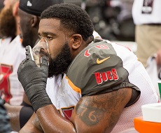
Speaks out.
Bucs left tackle Donovan Smith cannot stand it any longer.
Each Sunday during the NFL season, Smith, a very large man at 6-6, 338 pounds, has to look like a clown. A clown the size of a steer.
Each gameday, Smith must wear a giant, moving advertisement of all that is wrong with Nike, as well as a fundamental problem with the NFL because it craves nickels so bad it is gladly willing to sell its soul to look like color-blinded fools who dropped ‘shrooms.
Joe’s talking about the Bucs uniforms, embarrassing the franchise nearly as much as its play since the beginning of the reign of terror by inept Lovie Smith, with its alarm clock font numbers and CFL-inspired pewter shoulders.
In the wake of the news that the Los Angeles Chargers will reach back to their early glory days in San Diego and wear their powder blue jerseys as their primary home jersey, Smith couldn’t hold back any longer.
Smith wants a new uniform for the Bucs. Now. And if Team Glazer is wise, Smith prefers the return of the Creamsicles.
Hmmmm @Buccaneers can we go old school creamsicles ??? Primary home uniform 2019 ??? Asking for a group of ppl https://t.co/wFS30bbi2l
— Donovan Smith (@DSmith_76) April 17, 2019
Well now. “Group of people.” You don’t suppose Smith is referring to his teammates, do you?
Oddly enough, former Bucs wide receiver Antonio Bryant saw Smith’s post and retweeted it with a photo (photoshopped?) of him wearing the Creamsicles writing “RT if you want the @Buccaneers to bring these back.”
Smith coming out of the closet about the garish unis comes on the heels of Dave Bernreuther of Football Outsiders completely trashing the Bucs uniforms as the “worst set in the league,” among other things.
In 2018, after their closest geographic neighbors wisely ditched the two-tone helmets, the Buccaneers assumed the title of Worst Uniform in all of Football. For my money, it’s not even close. While I dislike the Nike-fication of Seattle and most college teams, which has gotten to the point that on Saturdays it’s often difficult to even know who the hell is even playing when you first look, most of that is at least coherent and/or based on an idea or theme that makes sense.
The Bucs, on the other hand, took one of the most unique uniforms in sports, one that was almost universally well-regarded, and for no reason whatsoever replaced it with a ridiculous alarm clock motif that looks like they accidentally submitted a third grader’s first computer graphics project. Their mandate to Nike may as well have been “hey, let’s see just how much worse we can make this.”
Who likes these things?
Are they actually selling that many Bucs jerseys that Nike likes them?
Joe agrees with Bernreuther in that there was no need to change from the classic reds. Joe’s a classic uniform kind of a guy. And if one must change a uniform, shouldn’t it change for the better?
And this dumb (yes, it’s dumb) second-helmet rule in the NFL has killed any chance of a return of the Creamsicles unless it is full-time thing, which honestly wouldn’t cause Joe to lose an ounce of sleep.
Joe’s two biggest issues with the uniforms are the pewter-colored shoulders that are different than the color of the jersey (those things just scream “CFL!”) and the alarm clock font. Call Joe a geezer if you wish, but numbers are on uniforms for one reason: identification. If one struggles to read the numbers, the jersey is a massive fail before the ball is kicked off.
The Bucs embarrass themselves enough on the field of play. Why add insult to injury with these things, year after year?


April 17th, 2019 at 12:10 am
You finally found something we can all agree on! We can’t stand the uniforms!
April 17th, 2019 at 12:20 am
Hate the uniforms, but who cares what I think, This post will be on moderation until Saturday afternoon.
April 17th, 2019 at 12:21 am
These uniforms are losers and represent the poor recent performance of our beloved Buccaneers. You want to start to change this culture? Start the change with new uniforms. There is a saying “the clothes make the man”. If this is so let’s get uniforms the players can be proud of. Seriously!
April 17th, 2019 at 12:28 am
One of the rare times i’m in agreement for something Donovan Smith did.
April 17th, 2019 at 12:31 am
glazer franchise is pathetic
April 17th, 2019 at 12:36 am
Going back to the creamsicles for this season (100th Nfl season) would be kind of cool. And then would give the owners a year to pick new uniforms for next year. It would actually be a profitable deal for team Glazer as most would buy merch this year in creamsicle colors and then next year with the new uniforms coming out. Hope this idea that smith proposed catches on, but I highly doubt it will. Maybe JOBUCSFAN can start a petition or something lol
April 17th, 2019 at 12:37 am
Oddly enough it doesn’t seem to matter, the owners you know the ones who never wear the jerseys decided this looked good somehow. They can’t even come up with a uniform no wonder they’ve been horrible at picking managers and coaches
April 17th, 2019 at 12:45 am
Keeeeeeeep the sucky uniforms..
UNTIL the team EARNS better ones…
Crappy team crappy uniforms….
Same with Creamsicles to red ones…..
Earn a better uni!
April 17th, 2019 at 12:48 am
Donovan just earned his paycheck in my book
April 17th, 2019 at 12:51 am
Ugliest uniform in the NFL right now. #GLAZERSKNOWNOTHING
April 17th, 2019 at 1:17 am
I do agree with Donovan but since I was a kid I’ve always thought the Steelers have the ugliest uniforms. Yuk. But we do need a throwback game with the throwback helmet. Enough already make it happen
April 17th, 2019 at 1:26 am
better keep what ya got cause I ain’t about to drop more cash on a new jersey.
April 17th, 2019 at 1:38 am
I despise the damn uniforms.
And the emblem on the helmets are ridiculously big.
Can’t we just go back to the super bowl unis. Or even the cresmsickles.
Just get rid of the current horror show. Plesse.
April 17th, 2019 at 1:47 am
“And this dumb (yes, it’s dumb) second-helmet rule in the NFL has killed any chance of a return of the Creamsicles.”
This is turning out to be a stupid rule. The latest research is suggesting that athletic activity is not connected to CTE. They are finding non-athletes with similar numbers of CTE-positive brain tests.
April 17th, 2019 at 1:53 am
DanBucsfan Says:
“Going back to the creamsicles for this season (100th Nfl season) would be kind of cool. And then would give the owners a year to pick new uniforms for next year.”
This cannot happen this way. According to agreements currently in place, any uniform change has to be kept for at least 4 seasons. I don’t know for sure, but suspect this rule is designed to protect consumers from being pressured into buying new jerseys every year.
Then again, does anyone really look out for consumers anymore?
April 17th, 2019 at 2:02 am
Our all red color rush unis are some of the best in the NFL, just wear those and make an all white version for home games and an all pewter for alternates. BOOM, problem solved.
April 17th, 2019 at 2:03 am
Eric Says:
“I despise the damn uniforms. And the emblem on the helmets are ridiculously big.”
Those 1982 digi-flip alarm clock numbers are the worst idea ever. And you are right about the jumbo helmet stickers. The only thing I would keep is the chrome face masks (if the helmets stay pewter).
I would expect that any normal company would have fired that design team. But then, Nike has sucked themselves for a while now. Plus, the Bucs’ unis aren’t the only ones they have ruined recently.
Nike is just another cog in the big wheel destroying American culture by design.
April 17th, 2019 at 3:38 am
Yep the uniforms really are awful. But its like everything else since the Glazier babies took over from their dad. Awful! That’s what you get when you allow owners who are more fans of soccer design and run things…
And the color rush uniforms look like Red long johns from the 1930’s. Equally or even more awful.
April 17th, 2019 at 4:57 am
Creamsicles Dammit!
April 17th, 2019 at 5:28 am
Most folks don’t remember the jokes and criticism brought by the original Bucs uniforms–especially the orange and the complicated logo that no kid could draw. That is why the second version with the priate flag logo was so popular.
Keep the newest logos and newest red color, but modify the jersey design, and start anew. They should keep the helmets as is and ditch what they call pewter in the jersey. Change the font on the numbers (lose the “chrome” color) but keep a tinge or orange in it for heritage.
I liked the old pewter color better, but something else most don’t remember…the owners didn’t like how sweat looked on the pants because that color showed every bit of crotch sweat there is…even during warmups. Marketing.
April 17th, 2019 at 5:42 am
Unis look like something designed by an acid dropper from the 70’s , they are by far the worst in sports.
April 17th, 2019 at 5:54 am
I’m sure the uniforms had to get the OK from the Glazers, this is proof positive that they have no clue what they are doing…..at all.
The fact they would OK these trashy uniforms speaks volumes that they can be led around and swayed by other stupid peoples opinions and not know the difference between good or garish and have the balls to do something about it.
This mind-set spills over to the operation of the entire franchise.
Glazers have NO CLUE what they are doing.
April 17th, 2019 at 5:55 am
What’s wrong with you all ? Creamsicle! Now that that was the worst uniforms in The NFL ever! We were the laughing stock of the NFL. Go back to the super Bowl colors. They should have never change those colors
April 17th, 2019 at 6:08 am
Shame on the owners for not doing something about this sooner.
The fans hate them
The players hate them.
Oh but Nike says they are cool.
Joes – start a petition to get 25,000 signatures or something like that …I ll sign it …others too…shoot get some players signature …viola …and we will deliver to one buc before preseason starts.
April 17th, 2019 at 6:13 am
It’s time. It’s time to change the culture and the attitude. It’s a perfect opportunity to start fresh and bring back some G-D dignity to this organization!
Not now, RIGHT NOW!
April 17th, 2019 at 6:34 am
PUKE!!!
April 17th, 2019 at 6:48 am
I wish they would run a fan-base survey. Maybe if they realized 80-90% of the fans detested the uniform, they would change it. The SB winning version was great, this is garbage. Hey at least the putrid unis cut across this divided nation and we can all be as one is trashing them!
April 17th, 2019 at 6:49 am
I actually like them as it makes us unique.
April 17th, 2019 at 6:51 am
Back to the orange is the proper way, in this 100th year at least!
April 17th, 2019 at 6:54 am
I don’t know this type of thinking by the players is why we so desperately need a culture change. Are they going to make you faster, stronger or a better player? Nope I sat through 20 years of losing with players wearing those exact same uniforms. How about they worry about why the are terrible year in and year out and improve their games? Instead our guys are worried about how they look in front of the camera. Right McCoy?
April 17th, 2019 at 6:57 am
Whereas I’m not thrilled with the current uniforms, I absolutely DESPISED the creamsicle orange ones. THEY were the worst uniforms in the league. Just go back to the unis from their superbowl days.
April 17th, 2019 at 6:57 am
I have not bought Buccaneers products since they addopted these uniforms, and I won’t until the real pewter and red returns.
Btw there is no pewter on these unis…it’s charcoal. And the old red was bloid red, not basic red.
April 17th, 2019 at 7:01 am
Couldn’t we start by switching our helmets to this:
https://images.app.goo.gl/Hb7J5KYRP4DA7pbM7
April 17th, 2019 at 7:05 am
Current uniforms SUCK!!!!
Glazers – change them NOW!!!
And for God’s sake – this time let the fans decide between 2 or 3 designs if a new design is preferred instead of going back to the Super Bowl era look that I think most everyone would be just fine with…..
Whatever you do about this – please don’t just choose another terrible design yourselves leaving players and fans feeling stuck with a look that nobody likes or wants…..
I said 5 years ago that I would NEVER buy a Burger King uniform looking jersey and have stuck to my word. Guarantee you that I am not the only one abstaining from spending any money on wearing this hideous design.
I’ll just keep rocking the half dozen or so Super Bowl era Bucs jerseys I have until the Glazers wise up….
April 17th, 2019 at 7:06 am
Go back to the red jerseys! Very professional. You don’t see the Cowboys, Steelers or Packers screwing around with goofy colors. Stay professional.
April 17th, 2019 at 7:09 am
Ndog probably still wears Members Only jackets and Jordache jeans.
Ya know…… cause it makes him unique.
April 17th, 2019 at 7:11 am
Agree…uniforms suck.
April 17th, 2019 at 7:17 am
Nike sucks. Bring back the Adidas uniforms. They looked great. It was stupid to change to the ugly Nike uniforms.
April 17th, 2019 at 7:18 am
Not much of a Twatter, what is RT? Is Bryant suggesting Smith move to right tackle?
April 17th, 2019 at 7:51 am
The Glazers probably thought this design would be attractive to the Millennials and lure younger fans, more than building a winner.
Small improvements: Make the sticker (lame) smaller; change the #s
OR
Wholesale improvements: Keep the Pewter; return to the classic red uniform design however, replace the red with Burnt Orange (red is overused) create a logo more dissimilar to Oaklands’.
The Creamsicles are cool occasionally but, nearly everyone hated them when the team wore it. Folks associated losing with those Creamsicles, even blamed them. The colors were not masculine enough; Busco Bruce is winking, remember?
A “Jefferey” and a winking pirate intimidates no one!
April 17th, 2019 at 7:55 am
Why am I in moderation, Joe? I said nothing about your man-child QB this time. “Your world, boss.”
April 17th, 2019 at 8:00 am
Go with the color rush uniforms those look amazing
April 17th, 2019 at 8:10 am
Love the helmet, Hate the uniform…
Also not a huge fan of the retro creamsicle unis either; that said, I could tolerate them a once a year…
Imo, keep the current helmet and redesign the current uniform…and for crying out loud, please get rid of the digital clock number font…
April 17th, 2019 at 8:21 am
Change em plzzzzzzz hater them since they changed them plzz go back to the classic red or even the creamsicles plzzzzz lol go Bucs
April 17th, 2019 at 8:26 am
If they win the uniforms will look better
Seattle’s neon jerseys are worse so are the Steeler throwbacks and Aqua and teal Dolphins are worse
April 17th, 2019 at 8:33 am
Agree with OneBuc55. Go back to exact Super Bowl uniforms and keep current helmet!!
April 17th, 2019 at 8:37 am
Creamsicles were and are the best uniforms we had. Everyone is trying to associate them with losing-that is a joke. Us losing associates us with losing- who cares which uniforms we were wearing. When we were in the playoffs in the late 70’s early 80’s they awesome. We even made an appearance on What’s Happening! because Dwayne picked us over the Raiders because he liked our uniforms better (we lost by like 50, LOL)
April 17th, 2019 at 8:40 am
Orange, white and silver! Bring back the pirate logo!
April 17th, 2019 at 8:51 am
The reign of terror that Bucs fans have had to endure is the one led by Backstabbin’ Jason Licht. It’s been 5+ years of nightmares and sleepless nights.
April 17th, 2019 at 8:52 am
Our Red and Pewter uniforms were some of the best in the league. I honestly don’t know why we switched to the crap that we have now.
April 17th, 2019 at 9:04 am
Ndog
The unbridled Jameis worship was one thing, but seriously, now we all know for sure that you’re deranged.
April 17th, 2019 at 9:20 am
Are you guys serious?? A few months ago you guys tried writing on Twitter that you don’t care how the uniforms look. And now that you guys see that most fans, AND PLAYERS, don’t like it you guys now want to stand on the side of hating the uniforms. Must be convenient to be able to make money on articles when you can always flip flop your stance on issues with this organization.
April 17th, 2019 at 9:22 am
The best part of the new uni’s for me was the helmet. The jerseys sucked. I would like to see us don the old cream color for awhile. I wouldn’t put Bucco on the helmet tho, I’d keep the same flag loco making the red flag orange also.
April 17th, 2019 at 9:23 am
Bandwagon:
Yes, in the grand scheme of things, Joe would take victories over any uniform design. Wins, at the end of the day, matter. A uniform doesn’t win or lose any game.
That doesn’t mean Joe likes those things the Bucs currently wear.
Not sure how much cash Joe can make off a uniform article. Possibly $4?
April 17th, 2019 at 9:33 am
Magadude good post. Appreciate the perspective
April 17th, 2019 at 9:36 am
He is asking for a large group of people. Cmon Donovan take that straight to the owners office. Be awesome if they brought back the orange. Those red ones were Ok but lets get back to the originals. Those were Awesome.
April 17th, 2019 at 9:37 am
He should have thought of this *before* he signed his contract.
What Donovan Smith does have the power to do is influence his player’s association to do away with the dumb second helmet ban when the new CBA is negotiated. That is preventing the Bucs from using the creamsicles as throwbacks.
April 17th, 2019 at 9:50 am
Pewter and red, and to hell with those gawd-aweful “color rush” abortions.
I despise the current Buc unis. Despise.
April 17th, 2019 at 9:58 am
i like the current unis and the throwbacks….i dont see what the problem is….lol….
#REALISTKNOWSNOTHING!!!!!…GO BUCS!!!!
April 17th, 2019 at 9:59 am
lowercaseg
lol….
#REALISTKNOWSNOTHING!!!!!…GO BUCS!!!!
April 17th, 2019 at 10:02 am
Go back to the SB uniforms – when we were winning. Couldn’t hurt.
April 17th, 2019 at 10:08 am
The numbers are what kill me. Like a digital clock, time to unplug them.
April 17th, 2019 at 10:09 am
Follow these steps carefully to prevent injuries.
Step 1) Stand up when appropriate and convenient.
Step 2) Clap your hand in agreement.
Step 3) Proceed to do the activity you doing before you read step 1.
I think the old Orange uni does looks better than the current unis. I think the pewter and red are the best.
April 17th, 2019 at 10:10 am
Love the helmets, despise the uniforms.
April 17th, 2019 at 10:37 am
The all red unis are slick
April 17th, 2019 at 10:41 am
Amen! Ditch those things for game days. Maybe save them to be pulled out if the team is having a charity cookout and the players are volunteering to flip burgers? They can then sing “hold the pickles, hold the lettuce, special orders don’t upset us…have it your way, at Burger King…” and look the part. 🙂
April 17th, 2019 at 10:52 am
Agree with others above though, the number font is probably the worst part of it…go back to the SB era number font as a cost effective compromise. The red/red color rush abominations almost make me pray the team has no Thursday night games. If they want eye popping gaudy then why not go full creamsicle jerseys and pants with the current design…that’ll keep em up on a Thursday night and tie in to the classic uni roots.
April 17th, 2019 at 11:07 am
I hate the current uniforms. Awhile back someone posted this helmet design, with the idea that it would work with the current color scheme, as well as with the throwback uniforms. I’m sure opinions will vary, but I like it. You will need to copy and paste into a search bar to see it.
https://www.bing.com/images/search?view=detailV2&id=DCD52BEC3614E958AF1A35AF8C953A22D9ED5F33&thid=OIP.O43gqafQfmN8aMUdIrSOmAHaFj&mediaurl=https%3A%2F%2Fi.pinimg.com%2Foriginals%2F5f%2F6a%2F20%2F5f6a208f5b122638ebd54fbfd8530c64.jpg&exph=375&expw=500&q=buc+helmet-charles+sollars+concepts&selectedindex=0&ajaxhist=0&vt=0&eim=1,2,6
April 17th, 2019 at 11:27 am
All hail Mr Smith!
April 17th, 2019 at 11:52 am
If they wanted to go back to the original colors the helmets would still be able to have Bucco Bruce on them . The flag fits so there should be plenty of room. And be the original color. I just never liked them but like the Super Bowl era. But please get rid of this current garbage.
April 17th, 2019 at 12:34 pm
The present uniforms are uglier than the Bucs play on gameday.
April 17th, 2019 at 12:37 pm
I’m not opposed to a modernization of the Creamsicle
http://i80.photobucket.com/albums/j169/pcola_playa82/NFL%20Revolution/TBbuccaneers_NPC.png
April 17th, 2019 at 12:47 pm
Phil Says
“Nike sucks. Bring back the Adidas uniforms.”
It was Rebok, not Adidas that was Red and Pewter.
April 17th, 2019 at 12:50 pm
@Anonymous
I was the one who posted that.
April 17th, 2019 at 1:56 pm
@Bonzai
Yes, I remember that now, and I’m “anonymous.” I think the one you posted was more pewter colored in the top front. This one looks black. I prefer the pewter, but either one would be OK.
April 17th, 2019 at 1:58 pm
Everyone hates the new uni’s
Some might not the creamsicle and have to do something with helmants
Absolutely no reason to not bring back SB reds with the our helmants we have now. NOW!!!
April 17th, 2019 at 2:06 pm
Other problems when it comes to creamsicle and new uniforms.
No reason what so ever to not bring back SB reds with the same helments as we have NOW!!!
How do these people not realize they’re losing millions in Bucs outfits all around.
April 17th, 2019 at 2:12 pm
The Bucs uniform looks like there were 15 people in a board room who all had “ideas” and they tried to get a piece of everyone’s ideas on the jersey so no one would be unhappy.
April 17th, 2019 at 4:54 pm
Donovan Smith is a genius….. He took the side of the one issue that would make him a fan favorite!!
April 17th, 2019 at 5:04 pm
Larger decal on the helmet is an improvement… keep them and go back to the red and pewter! immediately!
April 17th, 2019 at 5:56 pm
Man, the classic red & pewter uniforms were the best in the league. I would be stoked for these or the creamsicle to comeback. These are absolutely atrocious, one of the most disgusting uniforms change I ever seen…
April 17th, 2019 at 8:45 pm
That would be sick to bring them back full time for the home games…hell bring them.back for the entire SEASON !!!
April 17th, 2019 at 8:58 pm
What a shocker, Mr. instagram is worried about how he looks in his uniform. Glad we have a tough o line. It’s all about mentality and guys that have problems with things like uniforms definitely don’t belong in the trenches
April 18th, 2019 at 6:49 pm
Okay. I just became a Donovan Smith fan. If he can help bring back the creamsicle orange with such an eloquent argument then that is a guy I want on this team.
April 18th, 2019 at 7:00 pm
In the history of sports, no team has voluntarily downgraded their uniform the way this franchise has