


More Uniform Hate
May 22nd, 2015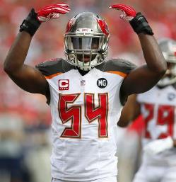
Many NFL fans in and out of Tampa Bay have thrown their hands in the air in frustration
Fashionista Paul Lukas of BSPN has revealed his annual rankings of NFL uniforms. Lukas does not like the Bucs’, which debuted last year.
Joe is a traditionalist and doesn’t like weirdo uniforms (oh, and this just in: Oregon, for example, doesn’t have uniforms, it has costumes. If you have two or more color schemes in road or home gear, you don’t have uniforms. Please consult Merriam-Webster for the definition of “uniform.” There is nothing “uniform” about Oregon’s gear.).
Classic, traditional uniforms are best, like the Packers, Steelers, Giants, Chiefs and Cowboys. The Bucs were in that group, too, until last year.
Joe caught holy hell last year for criticizing the uniforms — from V.I.P.s in high places. Joe understands there was a lot of effort and marketing behind the uniform change. Too bad it was a (very) flawed product.
As Lukas points out, there was no need to change the Bucs’ uniforms.
29. Tampa Bay Buccaneers (-18)
It wasn’t broken, but they fixed it anyway. The Bucs’ 2014 makeover took a perfectly decent uniform set and mutated it into a bad joke. The pewter now looks too brown, the helmet logo is now too big, the wordmark on the sleeves feels like an arena league move, and the uniform numbers, as a few million people have noted, look like they belong on a digital clock. The one new element that works: the chrome face mask, but that’s not enough to save this uniform set from the scrapheap.
The home red jersey looks OK. Under the lights it really pops. The white jersey is ugly, and Joe knows of no one that likes alarm clock digits. Who the hell likes to look at the same thing that wakes them up for work day in and day out?
Joe was afraid crap like this would happen when NIKE got their fingers involved (you know, the crowd behind the Oregon costumes?). And sure enough, NIKE stained the Bucs uniforms and from what Joe has heard, is shatting all over the Browns’ classic look. Why is NIKE intent on destroying tradition?
Because the Bucs stunk last year, the whole thing struck Joe as some cheap scheme to sell gear and gin up excitement since the team likely was going to stink. And that’s sad. (Remember when Bud “Badhair” Selig changed his Brewers uniforms every friggin’ year when the Brewers were the laughing stock of MLB? That’s one way to distract paying customers.)
The Creamsicles were cool. The Warren Sapp-era uniforms were sharp. Joe can’t say as much for the current crop.


May 22nd, 2015 at 5:17 am
It’s funny,I recall hearing last season from my peers and I quote”y’all suck but I like those jerseys”. Will be a none issue once the winning starts. I liken it to the artist Seal. He alone not the easiest to look at but next to those blonde beauties no-one seems to mind as much. Winning will cure this here shortly. Me I’m fine with my squads unis. Mutha@$!# who ever don’t like’em.”SkullGang-RedBanner,1ball 2blades”…
May 22nd, 2015 at 5:25 am
Joe I too am a traditionalist I wholeheartedly agree with you on this article it’s kind of a shamed of what Nike is doing to the league but it takes two to tango I guess the teams are letting Nike do this
May 22nd, 2015 at 5:28 am
“America’s Uniform” is a nightmare that fans will hopefully wake up from as soon as possible. It’s like Hugh Culverhouse’s ghost inhabited the body of whoever did the design in order to get revenge on the fans for having enjoyed a Super Bowl and a couple of playoff appearances. Hugh’s ghost will have none of that…fans must suffer and do so endlessly.
May 22nd, 2015 at 5:39 am
I would like to why three and a half weeks ago our winton jersey was subject to his number getting appropvoved? really?
May 22nd, 2015 at 5:49 am
U is are cool, except the alarm clock numbers, but I saw no need to change, I guess that’s why they didn’t ask me
May 22nd, 2015 at 6:31 am
#29 is a gift rating. Should be #32 for these clown costumes.
We went from one of the best to the absolute worst. Fortunately, I feared this was coming and bought enough of the better gear to last at least 5 years. Hope that by then there will be another change. This time for the better.
May 22nd, 2015 at 6:31 am
Not a fan of the new unis, but I do prefer the white jerseys over the red. They have a much cleaner look than the red.
May 22nd, 2015 at 6:51 am
Won’t find me buying that nastiness
May 22nd, 2015 at 6:52 am
personally I was lukewarm on the jerserys but once you buy one or see it on a friend it looks a lot better than it does on pads. but that is uniform hate the bigger flag on the helmets is the best part about the change. the uni’s we used a couple years ago are now the throwback uniforms since that’s what we wore when we had most of our success I think that’s smart to roll them out in a couple more years
May 22nd, 2015 at 6:54 am
NIKE is in favor of changing uniforms so they can turn around and sell them.
It’s all about money, but it always has been. They just know how to maximize profits better than most.
(I hate the new uniforms too. I wish we’d go back to orange and white.)
May 22nd, 2015 at 6:58 am
I guess the powers that be figure the uniforms will grow on the fans, yeah like a fast spreading flesh eating bacteria. Then again to each their own, fine design is under appreciated. Whoever came up with the idea of the numbers revamp is probably under police protection.
May 22nd, 2015 at 7:04 am
One year later, I still will never buy any buccaneer gear with this new look. Even if we win another super bowl. I’ll wear my old gear. I hate the new that bad.
May 22nd, 2015 at 7:04 am
The practice jerseys number don’t from a few years ago was perfect. Use that and it fixes the uniforms in a big way.
May 22nd, 2015 at 7:14 am
Gotta agree. Except for the helmets, the new uni’s are hideous! I’ll never buy one. Guess I’ll just keep rockin’ my Brooks, Lynch, Alstott, Barber jerseys.
May 22nd, 2015 at 7:21 am
Didnt like them initially. But after letting go of the old uniforms and giving these a chance, you will find they are actually really cool looking. The Helmet logo is not too big and looks awesome. The uniform has a modern look now, looks fast, mean, and overall fits the pirate theme better than the old ones. My advice to Joe and everyone else is to let go of the past. Stop pouuting. Go buy a jersey. They are sweet.
May 22nd, 2015 at 7:22 am
And Joe, update the jersey on your logo! Time to fully brace the Winston era. That includes are modern, killer looking threads.
May 22nd, 2015 at 7:30 am
The new unis are cool and the helmets are really cool. The numbers could be tweaked but I’m fine with the rest. Personally I didn’t like the pewter color on the old ones. I like some traditional unis, especially the the Steelers and Cowboys. However, I like some of the newer unis too, especially Seattle and the Bucs.
May 22nd, 2015 at 7:47 am
The Tampa Bay Buccaneers Uniforms…..”America’s Uniforms”
May 22nd, 2015 at 7:47 am
can’t stand the new ones they need to go back to the old ones.I’ll still cheer for my team not the uniform
May 22nd, 2015 at 7:50 am
The uni change would’ve been more acceptable if they kept the more traditional number font instead of changing to the widely panned digital font. I still like the old uniforms overall, but the updated pewter color on the new ones looks better imo. At least two more years before any changes can be made to my knowledge. I guess we’ll have to live with them.
May 22nd, 2015 at 7:53 am
I am not necessarily a traditionalist. I just would have liked to have seen a better upgrade of unis than the one they came out with. I am learning to tolerate these unis, but I think it will be impossible for me to ever say that I LOVE them. I’m still disappointed that this design was the “best” they could come up with given our colors and already great logo. I have still bought some jerseys (not for $150) just because I want to rep some of the players on the team specifically. Hopefully they decide to change them again in about 5 years.
May 22nd, 2015 at 7:54 am
I value the traditions of rivalry much more than uniform fashion. Like with music, sometimes new fashion takes some getting used to.
May 22nd, 2015 at 8:26 am
Of all the teams that I root for across all sports, the Bucs are my favorite team… and it’s a darn shame I won’t ever buy that jersey. I have 5 or 6 On-Field Reebok/Nike jerseys pre-digi-jersey all personalized with my name on them. If they can withstand game conditions, they can withstand my sitting in the stands. I’m sure those will get me through the decade until they come to their senses.
May 22nd, 2015 at 8:27 am
I actually love the new Unis. They really grew on me. also the white is way better than the red
May 22nd, 2015 at 8:37 am
Anyone know if the collective grumblings have gotten loud enough to be heard inside the executive offices? I would assume that the executive leadership would need to keep ther fans happy somehow…and we are not a competative team as of late
May 22nd, 2015 at 8:42 am
The new color combination(a dash of orange?) leads me to believe they found our new uniforms from the trash bin outside the Burger King Uniform Company. You know the one they didn’t even like.
No, I’m no fan of the new uniforms. The old ones were great!
May 22nd, 2015 at 8:44 am
Never seen an alarm clock with a slants in the middle of the numbers.
May 22nd, 2015 at 8:50 am
Jim
They exist just like alien bigfoots and sasquatch ghosts…..
http://ecx.images-amazon.com/images/I/41-pbBI4x7L._SY300_.jpg
May 22nd, 2015 at 9:01 am
The uniforms are so gay.
May 22nd, 2015 at 9:13 am
Had great looking uniforms and screwed it up badly with these butt-ugly things!
These uniforms SUCK!
May 22nd, 2015 at 9:16 am
Uniforms by Burger King
May 22nd, 2015 at 9:53 am
hahah uniforms by burger king is awesome RACK HIM…..bring back the 1978-79 florida orange uniforms those were the best and the team was teh best bring that back these are terrible
May 22nd, 2015 at 10:08 am
We have arena football league jerseys. they suck
May 22nd, 2015 at 10:54 am
Completely agree with you. There was so much tradition in our uniforms before we changed them for no reason & they coulda done a lot better than those areana league jerseys. Hopefully they change them again
May 22nd, 2015 at 11:08 am
If the Glasers want to really show us they care about fan opinion, switch the previous uniforms, PLEASE!
May 22nd, 2015 at 11:09 am
Winning changes everything.
May 22nd, 2015 at 11:28 am
The pewter on the shoulder just looks like a CFL scheme. The solid red jersey looked so much better. The alarm clock digits are ugly. The large logo, which isnt a bad logo, is just ok. This uniform is a mess and looks anything but professional. And honestly, we are not the team to try to pull off such an ugly, busch league design. I mean, i love the Bucs and i really want to like these uniforms, but nike screwed us. I mean, the Browns uni looks identical to their old one but what, we’re the Bucs so who cares how theirs turns out? I mean really. Our old uniforms were great. Not amazing but they were fine. Back in the day, everyone was mesmerized by our new red and pewter look. It was fresh, sleek and my goodness it was diffrrent, but our Tampa Bay Buccaneers pulled it off! I wish I could say the same about….those!
May 22nd, 2015 at 11:32 am
Great Milenko you are correct sir but winning still isnt changing that eyesore the bucs wear they are ugly and hideous, i can’t believe someone at nike thougt for a second they were ok, they should be fired right after lovie and licht roll out another 2-14 season
May 22nd, 2015 at 11:35 am
Agreed Joe! the new uniforms are completely tasteless, why did they mess a good uniform. too many bad things to list here, just go back to the sapp era now
May 22nd, 2015 at 11:40 am
I hate the new uniforms too. it’s absolutely ridiculous to be a Buc Fan and hate the uni’s so bad that i will never buy one. I want to buy 3 jersey’s. J Winston, V Jax and M Evans but i just cant wear them ugly things. There embarrassing. I loved our Pewter & Red Originals. I never thought it was possible to have a uniform that more people would dislike even more than some disliked the creamsicle uni’s. I thought we had the best uni’s in the NFL just a couple years ago. Now I believe we’ve got the WORST uni’s in the NFL. Unbelievable!!!
May 22nd, 2015 at 11:48 am
I agree that if they changed the numbers I would like them enough to buy multiple jersey’s but I just cant wear the existing jersey’s.Period. I do like the new helmets with the chrome face guard. That was the best change.
May 22nd, 2015 at 12:28 pm
Totally agree Joe, Bucs went from one of the coolest uniforms to the absolute worst. Change, for the sake of generating money doesn’t always work. Nike used the Bucs as their experiment and and both lost. The only thing as ugly as those uniforms was their play on the field.
May 22nd, 2015 at 12:40 pm
Awful teams play in awful uniforms.
May 22nd, 2015 at 12:55 pm
I would have rather had a just a slight update to the 2nd gens, but these are fine.
I will say that the White/White version is really ugly.
Red/Pewter or White/Pewter only!
Go Sucs!
May 22nd, 2015 at 2:01 pm
After Jamies brings this organization it’s next championship I’m willing to bet this will never ever be a topic of conversation again.
May 22nd, 2015 at 2:03 pm
Totally disagree. Like bucs white unis. Hate packers. All that yellow and green? Yuk. Don’t like Dallas unis either. Metalic gray and blue white. ucs ok not good but not bad.
May 22nd, 2015 at 2:41 pm
Like the wise man said “If it’s not broken, don’t fix it.” The only reason they changed the uniforms is to sell the new ones and make more money for the owners!
May 22nd, 2015 at 2:44 pm
You won’t catch me dead in one of those monstrosities. No amount of wins or playoff appearances or outstanding play from one Buccaneer will get me in one of those hideous excuses for representing a team.
If there was anything I could say or do or sign to get rid of those POS fast-food looking clown suits I’d probably do it.
If it ain’t broke don’t fix it. Stupid!
May 22nd, 2015 at 3:04 pm
Everyone up here likes the uniform. Just people bickering to bicker.
May 22nd, 2015 at 3:04 pm
I can live with the helmets if they would reduce the size of the flag. The numbers are an atrocity as everyone is well aware. I agree with Joe that the red jersey is not too bad other than the fonts. I like the first generation pewter and red the best but if we have to endure these Nike designed threads then I would suggest they at least reduce the size of the flag and change the numeral fonts. That would at least take the uniforms from ridiculous to acceptable.
May 22nd, 2015 at 3:08 pm
D@$! Skyline,it’s a miracle. I agree with you for the first time.
May 22nd, 2015 at 3:19 pm
That team wearing the “costumes” smoked “America’s Quarterback” and his team by giving a behind-the-shed beatdown in the Rosebowl last year. Those “costumes” serve as a recruiting tool for high school boys. The Ducks don’t care about what a bunch of 20+year olds think. The extra jersey sales is a byproduct.
I’m 35 and I rock my 2014 Lavonte David red jersey every Sunday – I love em. I love classic jerseys as well. Some people need to get with the times because the only constant is change.
May 22nd, 2015 at 3:28 pm
I knew you liked me.
May 22nd, 2015 at 6:23 pm
I will chime in a little late (getting caught up on JB Articles) but this is important to me-
1) Hate the new uniform- will not buy one.
2) Helmet looks great though
3) did you notice that the NFL Shop has never stocked the Nike Elite version of the new uni? (that is the $200 plus on field version) — hmmm…. maybe they have too much stock of the old jersey that no one bought because the team was not winning or, maybe, i wish i wish i wish i wish there is a tweak coming. i don’t know- change the numbers or something smaller.
4) new logo is a good upgrade
5) do not like the “Bucs” on the sleeve
6) as soon a I saw the new design I raced out and bought a red Lavonte jersey. . . looks like i will be wearing that for the decade to come.
7) likely no throw back game (helmet rule) and so no restocking of the creamsicle –i.e. do you really want to own a creamsicle Winston jersey when he has never actually worn it?
May 22nd, 2015 at 9:00 pm
Creamsicle jersey was ugly. Own two of the new jerseys….both Evans.
May 22nd, 2015 at 9:03 pm
Will probably get a McCoy jersey as well. Might as well have the best DT in the NFL, right.
May 22nd, 2015 at 9:41 pm
The new Uniforms SUCK! I want to get a Winston jersey – but I will NOT buy the horrible new design. Terrible, Terrible decision to go with these clown costumes. FIX THIS Glazers. Admit the mistake and go back to the previous design or do something different and have NIKE stay the hell away from the process.
May 23rd, 2015 at 1:07 pm
Meassage to Lovie: New Era, Jameis is in town! By now, I’m pretty sure you are aware of your fan base hate for these uniforms. Please bring back the old red and pewter with a killer design and you’ll also give Winston a new fresh start with his new team.
May 24th, 2015 at 2:17 am
“Classic, traditional uniforms are best, like the Packers, Steelers, Giants, Chiefs and Cowboys.”
And all of those teams, with the exception of the Chiefs, are among the greatest NFL franchises of all time.
Funny how the ugliest uniforms always tend to belong to the consistently bad teams (Bucs, Jags, Browns, etc!)
May 24th, 2015 at 8:15 am
The uniforms look as though a dog ate a can of Alpo along with a can of pumpkin pie filling and then “squeezed out” the uniform scheme that we now have. It’s disgusting. It’s even worse that there is a patch on the sleeve that says “BUCS.” Totally F-ed up.
May 24th, 2015 at 6:57 pm
Our old uniforms looked great. These look cheap. Not a fan. Wish old uniforms would come back.