


Uniform Euphoria
March 3rd, 2014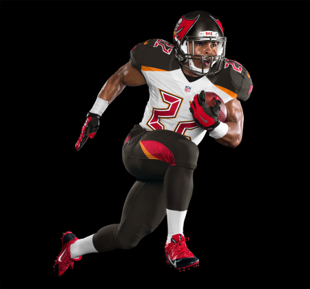
Image courtesy of Tampa Bay Buccaneers
Look, Joe’s written previously that uniforms are far, far less important than the players wearing them. Joe’s not a fashionista.
The Bucs rolled out part of their new look this morning, and Joe’s very excited to see what the other variations look like, how the jersey looks from behind, and to take in the look in real lighting.
Yeah, Joe gets that any kind of change gets many fans’ underwear in a bunch. Some love it; some don’t. You can’t please everyone. But Joe will wear the new Bucs gear with pride because that’s what fans do, especially when the team is winning.
(Joe can already envision how sweet a Manziel or a Penn jersey will look.)
Joe actually likes that the Bucs took their Lovie Smith overhaul of the franchise all the way. The commitment to a new era is exciting.


March 3rd, 2014 at 10:54 am
You all don’t like em now but they will grown on yall
Kinda like when Seattle released their unis
March 3rd, 2014 at 10:54 am
Agreed Joe!
March 3rd, 2014 at 10:55 am
Love the helmet. Jersey, not so much. Hideous orange accents. I’m sure the players are excited they get to wear black in the Tampa sunshine! Oh and the numbers, i would rather them not look exactly like my alarm clock.
Overall…..WOOF.
March 3rd, 2014 at 10:55 am
It’s my team so I’ll buy the jersey without a doubt. Just gonna take some time to get use too is all I’m sayin. But I see your point joe. I’d just like to see a better pic of it myself before I say I hate it or love it
March 3rd, 2014 at 10:56 am
So you no longer want to vomit??
Actually, Joe advised readers to hold back their vomit and give it a chance. Don’t assume. –Joe
March 3rd, 2014 at 10:57 am
That is closer to back than pewter. And there is hardly any red left.
“I bleed Pewter and Red” no longer fits.
I really, truly hate these uniforms.
March 3rd, 2014 at 10:58 am
Only Vick could make me give up my season tickets…but I considered it this morning.
March 3rd, 2014 at 10:59 am
Love it!
March 3rd, 2014 at 11:00 am
BTW…what happened to the “chrome” face mask????
March 3rd, 2014 at 11:00 am
kinda look like what maryland did with there uniforms in the college ranks…kinda different and not a fan just yet….
March 3rd, 2014 at 11:00 am
Joe bucs need to change website color scheme.
March 3rd, 2014 at 11:00 am
The only thing about this that is good is Doug is running again.
March 3rd, 2014 at 11:03 am
Hey Joe, then why change your words? Vomit was switched to anger.
Joe thought that was more fitting, for those like you that misinterpreted. –Joe
March 3rd, 2014 at 11:03 am
It isn’t the change. I wanted some change. This is absolutely awful though. I mean its horribly badly done. An embarrasment.
And that’s coming from someone who wanted a uniform change.
March 3rd, 2014 at 11:03 am
Are you freaking kidding? Hideous! This has to be some kind of joke, right? My God – they’ve completely lost it over there.
March 3rd, 2014 at 11:04 am
This is the away jersey, just FYI.
March 3rd, 2014 at 11:04 am
Not bad. I just like the fact that the Bucs are one of the teams that can change their uniforms without issue. Unlike some teams, i.e., Packers, Bears, Steelers…their fans would erupt in violent riots if their unis changed.
March 3rd, 2014 at 11:05 am
Joe, since they did not picture Revis, it means that they will trade him. How do you not have the most important Buc and not picture him in the new uniform. He is good as gone!!!!!!
March 3rd, 2014 at 11:05 am
Houston Astro Bad….
March 3rd, 2014 at 11:06 am
Take a look at those two tone shoes. They remind me of spats the men wore in the 1930s……Do you realize these are the jerseys we will wear and pay at least $100.00 for the “honor” to do so.???
March 3rd, 2014 at 11:08 am
I like the new uniform, it’s a nice blend of old and new. I’m more intrigued by the secondary logo of the wooden pirate ship. Could this be a different helmet? Maybe the white helmet that was floating around twittter a week or so ago to replace the throwback helmet that the NFL didn’t allow the Bucs to wear last season? That would be very cool, imo.
In any event, I’m not really a jersey guy, but I plan on getting a Lavonte David jersey as soon as they become available. So far, so good, next up is free agency.
March 3rd, 2014 at 11:09 am
Show us the unis in real lighting, JOE!
March 3rd, 2014 at 11:09 am
This uniform makes me wanna throw up lol
March 3rd, 2014 at 11:10 am
The_Buc_Realist Says
“Joe, since they did not picture Revis, it means that they will trade him. How do you not have the most important Buc and not picture him in the new uniform. He is good as gone!!!!!!”
At least imitate intelligence. That was stupid. 😉
March 3rd, 2014 at 11:11 am
We are taking an absolute POUNDING on PFT comments section.
March 3rd, 2014 at 11:11 am
I like the new uni! The thing I like best is the word “New”. If they bring a new attitude along with it, they’ve succeeded.
On my Mr. Blackwell fashion meter, I give it an 8. If they change the number to traditional and take out the orange accents, I’m at a strong 10! Go Bucs!
March 3rd, 2014 at 11:11 am
anyone seen a picture of the alternate Pirate ship logo???
March 3rd, 2014 at 11:12 am
Who designed these Barnum & Bailey. Doug looks like he’s fresh out of clown school. I just hope they kept their old unis in reserve.
March 3rd, 2014 at 11:14 am
I dont like that the shoulders are gonna be pewter. Shouldve been left on jus the pants
March 3rd, 2014 at 11:15 am
The numbers, as someone on NFL Network just pointed out, look like a cheap digital clock. Great job, morons!
March 3rd, 2014 at 11:15 am
“New” 1980s LED lettering.
I think I need vodka and its only 10am.
March 3rd, 2014 at 11:19 am
Take a look at them dere shoes. Those two toned shoes remind me of the spats men wore in the 1930s……and to think we will be wearing those Jerseys to support the team…. And have the privilege to pay at least $100.00 to do so!!!
Will still do it but…ouch!
March 3rd, 2014 at 11:20 am
Why did they have to go with digital alarm clock numbers?
March 3rd, 2014 at 11:22 am
The numbers look like a 1980’s alarm clock. The color scheme is awful. I hope it is pewter. Maybe it will look better. We do play as well as an arena team so we might as well dress that way. Not happy.
March 3rd, 2014 at 11:24 am
I think they are amazing give them a chance .
March 3rd, 2014 at 11:24 am
Even the pewter looks like Brown now. They darkened and de-metallicized it. Its just brown now. Plain old ugly brown.
March 3rd, 2014 at 11:25 am
I have no issues with this. I just want to see who will be wearing them. If we are winning no one would really care.
March 3rd, 2014 at 11:26 am
Again, as I stated in the comments a moment ago, I don’t mind the uniform change, but the style of the jersey numbers are a little wacky. 80’s alarm clock is a fitting description, lol, but again, let’s wait until we see an actual picture of a Bucs player dressed in the new uniform.
March 3rd, 2014 at 11:28 am
I’ll wait until I see the uniforms live before I wager one way or the other. The grill appears to be black in this photo.
March 3rd, 2014 at 11:28 am
Taste is always a tough thing. I think they are terrible, but it’s not science.
They should have let the fans have some input. Now all we can do is just not buy the new merchandise. Dollar votes.
March 3rd, 2014 at 11:29 am
Why do they even bother releasing these pictures when it supposedly doesn’t do the uniform justice? And Sapp says…….
March 3rd, 2014 at 11:29 am
Everyone needs to take a deep breath and CHILL! Joe made the best point of waiting till you see the new uniforms in the real light. When the first photos of the helmet were released they looked dark gray all over and didn’t match the description released at the same time. Later photos showed that the color is more of a lighter pewter color that is darker at the top and gets lighter toward the bottom with a gradation around the ear holes. The helmet in the new uniform photo looks like the dark helmet in the first photos and the pewter on the jersey almost matches the helmet which means in outdoor lighting the pewter on the uniforms will probably be a lot lighter. So I agree with Joe . . . wait and see what they really look like in person or in outdoor light before deciding if you really hate them or not.
March 3rd, 2014 at 11:29 am
OMFG, they are awful uniforms. So much for the Pewter Pirates huh ?
Plus, the orange comes from a time when we sucked even worse then we do now.
What was this designer thinking ?
March 3rd, 2014 at 11:31 am
I hate the Glazers right now. Always having fix things that aren’t broken.
March 3rd, 2014 at 11:32 am
Hate it.
March 3rd, 2014 at 11:33 am
It cracks me up to listen to Buc fans whine and complain about the most silly of things. Then threaten not to buy any more jerseys or season tickets LMAO. To funny. Good fricken riddens is what I say.
March 3rd, 2014 at 11:34 am
Go to the main joebucs page and you can see a comparison of the new and old white jerseys with Doug Martin above the Mike Glennon picture. After seeing the comparison, the new uniform makes the old one look so boring.
March 3rd, 2014 at 11:35 am
Great new uniforms. We still need the big floppy shoes, white makeup and bulbous red noses to be complete.
March 3rd, 2014 at 11:35 am
That uniform almost made me loose my breakfast this morning! More red less black and orange please. It looks so cheap and generic. I was looking forward to the new look but now not so much. Hopefully it gets better.
March 3rd, 2014 at 11:37 am
I am good with the new threads. Helmet and all. Unfortunately, I am old enough to remember the Creamsicle years. I will have to get comfortable seeing even a little bit of orange back on the Bucs. They are still my team. No matter the damn uniform! #GoBucs !
March 3rd, 2014 at 11:39 am
It cracks me up to see the so-called diehard fans act like this insult is just fine with them, and we should just accept having this joke shoved on us. Its embarrassing. One thing it will enhance – the paper bag industry.
March 3rd, 2014 at 11:41 am
No, no dont accept it. By all means, go be a fan of another team who jersey is much more attractive that ours. We wont miss you I promise.
March 3rd, 2014 at 11:42 am
Since the Bucs play like a CFL team, it only makes sense that they should look like a CFL team. Will Jason Light’s first order of business be to schedule a preseason game with the Montreal Alouettes?
March 3rd, 2014 at 11:42 am
The creamsicle unis were way better than these. Way better.
These look like the love child of an alarm clock and pile of dog crap.
March 3rd, 2014 at 11:44 am
Other than people who will never slam the Bucs, I haven’t seen one person say these are anything other than awful. They seriously look like someone used Design a Uniform in Madden and this is what they came up with. There was absolutely nothing wrong with the previous design other than you make more money selling something new. That is, of course, assuming that new thing isn’t atrocious. Who would want to wear one of those in public? The Creamsicles don’t seem so awful anymore do they?
March 3rd, 2014 at 11:46 am
Even though the numbers on the front look exactly like the numbers on the front of my alarm clock, I kind of like the rest of it. I think it will grow on people.
March 3rd, 2014 at 11:46 am
We had one glory year in the pewter and most are hanging on to it like Kate Upton’s teat.
It’s time to deal with the past… as in end the nightmare.
March 3rd, 2014 at 11:46 am
We pulled off the impossible.
We have an uglier uniform than the Jags now.
March 3rd, 2014 at 11:48 am
I went back and looked at the helmet colors under the lights. The pewter is not as dark as it’s shown in the picture.
http://www.buccaneers.com/multimedia/videos/360_Degree_View_of_Buccaneers_Helmet/d5dbdd7c-82a0-48b4-ad0f-80fc974cca8c
March 3rd, 2014 at 11:48 am
just win baby
March 3rd, 2014 at 11:51 am
Have the Bucs been relegated down to the XFL?
March 3rd, 2014 at 11:52 am
Where’s the pewter? Where’s the chrome face mask? No team in the league had pewter only the Bucs. And though new, no team in the league had a chrome mask either, only the Bucs. Now what, tons of black??? Gee, what an original color, I’m sure it will be nice and comfortable in the Florida sun.
U-GGGGGG-LLLLLL-YYYYYY!
March 3rd, 2014 at 11:53 am
“No, no dont accept it. By all means, go be a fan of another team who jersey is much more attractive that ours. We wont miss you I promise.”
Can someone translate this into English? A mind is a terrible thing to waste, but not as terrible as this joke of a “new uniform”.
Laughing stock….
March 3rd, 2014 at 11:54 am
……and creamsicle orange only reminds me of the many years of embarrassment, I bet Johnny Carson is LOL!!!
March 3rd, 2014 at 11:56 am
I think it looks pretty awesome, especially for an away uniform. Can’t wait to see the home version.
March 3rd, 2014 at 11:56 am
And I thought the helmet design took a while to get used to…
That being said, I don’t trust this picture at all. The helmet looks black just like it did in it’s press release photo and we all know that when we actually saw the helmet live it wasn’t even close to black, it was pewter. So all this “black” in this photo I expect to be pewter which could make the whole thing look different. Plus I’m interested to see how this reflective chrome border on the numbers look in person. Hoping a better look at the numbers will make them look not quite as digital, but we’ll see. I want to like these, but it’s gonna take time and seeing them in real lighting.
March 3rd, 2014 at 11:57 am
This is the away uniform… Home uni should be white & pewter, with burgundy/orange accents…. PLEASE lol
March 3rd, 2014 at 11:58 am
I like the uniforms, but from now on when the Bucs enter the red zone, they won’t fire cannons, they will play the signature beep track from 24.
March 3rd, 2014 at 11:59 am
These suck! We used to have one of the best looking uniforms in the NFL. Now we’ll be near the bottom of the league in looks.
March 3rd, 2014 at 12:00 pm
Save the picture. Open the picture in MS paint or photo shop. Use the fill and change the background to another color. Looks much better
March 3rd, 2014 at 12:02 pm
Maybe these uniforms will protect the players from MRSA.
March 3rd, 2014 at 12:04 pm
These suck! We used to have one of the best looking uniforms in the NFL. Now we’ll be near the bottom of the league in looks.
————————————–
Well there goes our playoff chances.
March 3rd, 2014 at 12:08 pm
Ummmm I see the Crome face mask
March 3rd, 2014 at 12:12 pm
BRUTAL!!! Went from the best uniforms to arguably the worst. Might aswell top it off with the gross 2 tone helmets that the jag wear.
March 3rd, 2014 at 12:13 pm
Wow, I could get behind the updated logo and helmet, but these uniforms are ridiculous looking. But in the end I just want them to win. I don’t care if their wearing pink tutus and mom jeans.
March 3rd, 2014 at 12:15 pm
WHAT HAPPEN TO THE CHROME HELMET SAPP DISPLAYED ON NFLNETWORK???
I SAW A GREY UNIFORM ONLINE THAT LOOKED BETTER
March 3rd, 2014 at 12:15 pm
I don’t like them.
March 3rd, 2014 at 12:16 pm
I like it! Change is always met with hesitation.
March 3rd, 2014 at 12:17 pm
@chris I don’t think the Bucs like the wording of vomit .
March 3rd, 2014 at 12:22 pm
@Shawnbucfan, I think you may be right. But I’m just hoping there are better pictures coming. Not sure I can rock that jersey.
March 3rd, 2014 at 12:22 pm
I f****** love it.tampaaaaaa
March 3rd, 2014 at 12:31 pm
Black Anyplace on the Uni’s ????? Since ole Malcom had his stroke the team has fallen on hard times
March 3rd, 2014 at 12:33 pm
Is that black or Cleveland Brown, brown?
March 3rd, 2014 at 12:36 pm
Ugly is an understatement for these getups. It looks like somebody on meth designed them. Better lighting will make them uglier. People just can’t leave well enough alone. I’m sure through repetitive seeing they will grow on me, just like ear and nose hair. What is this, the year 2100 fashion.
March 3rd, 2014 at 12:43 pm
The new uniforms will eventually be more widely accepted than they are today. I don’t completely hate them but I don’t like the number font. The digital font has nothing to do with the teams history, logo, etc. The number font used before was much more traditional and looked great. The team said the new look honors the team tradition, but I don’t see that at all. It looks like a complete modern overhaul to me.
March 3rd, 2014 at 12:47 pm
Who,cares as long they score points and stop the other team from scoring. I am more interested in who will be wearing the new look.
March 3rd, 2014 at 12:50 pm
This looks terrible especially the font and its hot outside already and you want me to wear a black jersey… sumone needs to be fired..
March 3rd, 2014 at 12:50 pm
This uniform definitely has “Glazer” written all over it, that’s for sure.
March 3rd, 2014 at 12:56 pm
NFL Europe!
March 3rd, 2014 at 1:00 pm
WAAAA WAAAA
Let’s complain about everything all the time
WAAAA
March 3rd, 2014 at 1:02 pm
Let’s complain about complaining! WAAA WAAA
March 3rd, 2014 at 1:04 pm
Is Freeman was still here, he wouldn’t get the alarm clock reference
March 3rd, 2014 at 1:06 pm
“Joe actually likes that the Bucs took their Lovie Smith overhaul of the franchise all the way. The commitment to a new era is exciting.”
Joe, I guess you don’t realize these changes to the logo and uniform were started a year and half ago. It takes that much time to get the change complete(NFL notification, licensing and stoppage of old merchandise, etc). They had to warn the league a year in advance, just to notify them of a change. So, this would have started under the Schiano regime, not because they hired Lovie.
Please, the Bucs may have sought approval in advance, but that doesn’t mean they had to implement it now or ever. –Joe
March 3rd, 2014 at 1:07 pm
Anyone not complaining must not buy the jerseys.
March 3rd, 2014 at 1:07 pm
Grab your tissues and get the hell over it 😉
March 3rd, 2014 at 1:07 pm
Sorry. *IF* Freeman was still here
March 3rd, 2014 at 1:07 pm
Shut up PRBucFan, we have every right to b&#ch. It’s been embarrassing enough to be a Bucs fan for the last 6 years. The loyal Bucs fans like us deserve better than this.
March 3rd, 2014 at 1:09 pm
They just released them today and they’re basically a crime against humanity. You should have at least waited a day before you tried to shut down complaints.
March 3rd, 2014 at 1:09 pm
Bitch all you want, isn’t going to make the slightest bit of a difference
And please, make me
March 3rd, 2014 at 1:11 pm
Let’s be real, they could of just changed the shoe laces to an unfavorable color and the sky would be falling to many of you people.
It doesn’t matter what they could possibly do, you’d still find something to whine about.
Like I said, grab your tissues and move along.
Smh ahahahahaha
March 3rd, 2014 at 1:11 pm
It’ll make a difference when I don’t buy a jersey this year.
March 3rd, 2014 at 1:13 pm
No it won’t lola cause they will still be making a profit off all the other “fans” still buying the jerseys lol
March 3rd, 2014 at 1:14 pm
Oh well then. I’ll still vote with my wallet against this monstrosity.
March 3rd, 2014 at 1:16 pm
Well that was fun lol
Y’all be nice now you hear ahahaha
Much love 😉
March 3rd, 2014 at 1:20 pm
Like someone else said, this picture might be to dark of a version, that black could actually be closer to pewter. If it is, it would look much better. I’ll wait and see.
March 3rd, 2014 at 1:21 pm
why does everyone hate them I think they’re awesome.I love the old school creamsicle orange look.on NFL Network they said. there actually going to have chrome on the uniforms
March 3rd, 2014 at 1:22 pm
Has a Houston Astros from the 70’s look to it.
That’s not a compliment.
March 3rd, 2014 at 1:22 pm
Since they enlarged the flag on the side of the helmet they should enlarge the flag on the field to between the 30 yard lines on either end, that should deflect attention from the uniforms and play on the field.
March 3rd, 2014 at 1:23 pm
NFL Network said there will be chrome on the uniforms.love it.
March 3rd, 2014 at 1:26 pm
everyone will love these eventually.they will look a little different then what we’re saying now.tampaaaaaa
March 3rd, 2014 at 1:28 pm
As for the uniforms, those “LED” numbers are horrible!
Hey……hey…..It’s the Tampa Bay Calculators!
March 3rd, 2014 at 1:28 pm
new uniforms new head coach new players new era in Tampa Bay.I have never ever been this excited in Tampa Bay History. Woooooooo
March 3rd, 2014 at 1:28 pm
I just might buy a few hundred jersies……………..at the $1 store.
I predict it will be a big hit for homeless fashionistas.
March 3rd, 2014 at 1:29 pm
where’s Big Mac at.I need positive true Tampa Bay fans on here.who is excited as me for this upcoming season.
March 3rd, 2014 at 1:30 pm
TNBucfan has a point. They look much better when not shown against that artificial black background
March 3rd, 2014 at 1:30 pm
I want to vomit. Changing the best uniform in the League to this garbage is a joke..
Oh well, the Bucs have been a circus for the past decade and now they have the clown outfits to match the level of entertainment. Maybe they will look good in Hi-Def for the majority of the fan base since most people don’t go to the games
Fortunately, I bought enough game day gear last month to last another 10 years.
March 3rd, 2014 at 1:30 pm
I have never had enough money for season tickets but this year I’m buying them.this year is historical.I smell Super Bowl
March 3rd, 2014 at 1:32 pm
I hate all of you negative f****
March 3rd, 2014 at 1:35 pm
all of you negative f****.are all of the bandwagoners.who only say positive things after the Bucs won a Superbowl or do something else great so therefore shut up.
March 3rd, 2014 at 1:36 pm
b.Bruce
lol calm down man. It will just take some time to get used to. love your enthusiasm though.
March 3rd, 2014 at 1:37 pm
That’s some strong koolaid
March 3rd, 2014 at 1:40 pm
This reminds me of when Coca-Cola came out with “New Coke”. There was such a revolt that they switched back to the “original formula”. That turned out to be a marketing ploy. Is that what we are seeing here?
March 3rd, 2014 at 1:42 pm
FINALLY!!!!!!!!!
Something to argue about besides Glennon
March 3rd, 2014 at 1:42 pm
The helmet looks good but those jerseys send us back to the YUCKS ! I’ve been a Buc fan since 1977 and remember taking a lot of flack for the orange colour jersey, but still wore it with pride.But this is the worst yet! Love my red jersey ,love my orange jersey but will I buy this new one ? I doubt it right now.Please Buc brass change this jersey!!
March 3rd, 2014 at 1:45 pm
It’s an abomination.
March 3rd, 2014 at 1:46 pm
Yeah, one buc needs to stop doing these photos in a studio…what matters is how they look on the field. I want to see that. I know you don’t think it’s too important Joe, but when I played my coach was a firm believer in in nice uniforms.
“If you look good then you feel good. If you feel good then you play good.” And it may seem petty, but he was right.
So I guess it matter what “the players in the uniforms” think.
March 3rd, 2014 at 1:58 pm
@adamant
I’m convinced that whole thing was a ruse to remove sugar and replace it with much cheaper corn syrup as an ingredient.
March 3rd, 2014 at 2:05 pm
I like them except for the font used for the numbers. I wish the numbers had more of a pirate theme instead of digital. I am more concerned with the way the team plays.
March 3rd, 2014 at 2:09 pm
Tampaaaaa
March 3rd, 2014 at 2:11 pm
Wow, that font for the numbers was SUCH a poor choice. I can patiently reserve judgement on the rest of the changes … but … Wow . I don’t foresee coming around on the font at all.
March 3rd, 2014 at 2:11 pm
Uggg. Im not feeling it. Ill hold my vomit as Joe requested. Hopefully they grow on me. The numbers look terrible. I feel like Im looking at an old school digital clock and thats not a good thing. the color scheme could grow on me but those numbers are a fail.
March 3rd, 2014 at 2:12 pm
Let’s hope they have a lot of throw back games and the throw back uniforms are the pewter and red
March 3rd, 2014 at 2:12 pm
instead of saying Tampa Bay.when I say bandwagoners and stupid negative bastards you say shut the f*** up.I’ve never been so excited for season to start.
March 3rd, 2014 at 2:18 pm
I like it. Good uniform for the 21 st Century. Embrace the change….
March 3rd, 2014 at 2:24 pm
I have this feeling it’s a bad omen of things to come. I am not one to complain and whine just for the sake of it. I love my Bucs, but I will NOT buy this uniform.
It just doesn’t look like a Bucs jersey to me. And where is the pewter, all I see is dark gray charcoal color? They should have just updated the pants. I do like the flag logo on the sides.
My only hope is when we see these in real life, they still somehow look like the pewter and red Bucs, and not some University of Maryland / XFL uniform mashed up on LSD.
March 3rd, 2014 at 2:42 pm
When 95% of comments I’ve read are putting these jerseys below Arena Football and XFL Jerseys…I mean wow these are getting destroyed. Not sure how anyone can justify them, unless you enjoy being relieved of money from your wallet for something new. This isn’t an improvement, and the Bucs unis prior to this were considered upper echelon. I really hope these tank spectacularly bad and they switch back within 2 years. We can make it happen, just don’t buy this. You are supporting crimes against humanity by buying these…
March 3rd, 2014 at 2:46 pm
This just in: it’s being reported that the Beatles dentist made his way to One Buc Place and slipped some acid into the Glazers coffee…….and BOOM, the idea was born!
March 3rd, 2014 at 2:53 pm
hahahahahahahahahahahah……welcome to the circus. why not smear purple in there too….
March 3rd, 2014 at 2:55 pm
bucrightoff…other than a hat… no grown a** man should be wearing team gear….
March 3rd, 2014 at 3:02 pm
Joe, I have always found that simple is better, these uniforms look like a third world country’s military uniform. Maybe the chrome grill will make fourth world or second, but they are not the Bucs.
If the players think they do not look good in them they will play bad so we will see.
March 3rd, 2014 at 3:04 pm
Just watched the video on buccaneers.com and saw the new uni’s on video and they sick nasty!
March 3rd, 2014 at 3:07 pm
Root for the Bucs, spend your merchandise $ on the Bandits.
March 3rd, 2014 at 3:08 pm
As long as they win….whatever…
March 3rd, 2014 at 3:09 pm
What’s worse? These or the Marlins unis?
March 3rd, 2014 at 3:12 pm
Only thing I don’t like is that orange on the top. Paired with the white and black makes them look like the Bengals. And the digital clock numbers are a little too much. Otherwise they look dope.
March 3rd, 2014 at 3:15 pm
home and away jerseys are up on the official bucs site
March 3rd, 2014 at 3:16 pm
Chef Paul Said:
March 3rd, 2014 at 1:04 pm
“If Freeman was still here, he wouldn’t get the alarm clock reference.”
LOL. Funniest post on the thread…
When I first saw it my reaction was, “Damn that’s ugly!” I took a second look to see what it was about it that I really didn’t like, and I realized like some others have said, it’s the digital numbers. Change the font on the numbers and I think the uni will look good.
March 3rd, 2014 at 3:18 pm
I watched the video PR Buc was talking about. The unis did seem much better after seeing that but I just can’t get past the numbers. Although the glow in the dark aspect of the numbers is cool.
March 3rd, 2014 at 3:19 pm
The home jerseys look pretty damn good, the away jersey are just ok. Its those numbers I dont care for
March 3rd, 2014 at 3:20 pm
Now that I’ve seen all the pics on the Bucs website…I dislike them even more. Capping off the total amateur hour apperance is actually putting the words “Bucs” on the shoulder. Like really? Ugh…just awful. In fact they are so bad I’m actually now convinced new jerseys (not these, even more new jerseys) are coming in 2-5 years. It’s gonna be the new NFL cycle, change unis every so often to increase merch sales.
March 3rd, 2014 at 3:22 pm
I’m liking it more in the video:
http://www.buccaneers.com/multimedia/videos/Making_the_Uniform_Behind_the_Scenes/6db023d6-2c97-400d-aae0-3111b41d951
March 3rd, 2014 at 3:26 pm
I didn’t think we needed a uni change, but this looks really awesome to me. The only thing that looks a little off is the number font, overall is great, IMO. (and I’m an artist/oil painter/graphic designer and huge bucs fan for like 30 years now)
March 3rd, 2014 at 3:33 pm
And hey, look on the bright side, the bucs players wont like look they pissed themselves anymore. lol
March 3rd, 2014 at 3:39 pm
FUGLY. And not to put this down but, now add pink shoes and gloves.
March 3rd, 2014 at 4:45 pm
Joe
‘Please’, So the Buc’s put a notice in to the NFL just for a “just in case we want to change or logo and uniform thought”? Ha, I don’t think so.
March 3rd, 2014 at 8:17 pm
I’ve been a JoeBucsFan follower for about 4 years now. I love the articles and the ridiculous arguments, but have never posted. Got to start now. Woke up this morning and hit the site as usual and wished I had never woke up. I want to know why in the hell would they take one of the best uniforms in the NFL and put this piece of sh!t uniform out. This last season was extremely hard to suffer through, but I think I’m suffering more right now than I did during the whole of last season!…
Hell of a great job Joe, keeping me connected up here in North Carolina!
March 3rd, 2014 at 10:06 pm
The helmet doesn’t match the uniform at all. WTF?????
March 3rd, 2014 at 11:45 pm
The font size of the numbers looks small. I sit in upper decks all I can afford now its going to be harder to tell whos number is out there.. very disapointed..