


A Look At The Bucs’ New Uniform
March 3rd, 2014Try to hold back the anger and give it a chance. A deeper, closer look is forthcoming this afternoon.
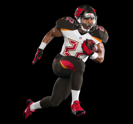
Image courtesy of Tampa Bay Buccaneers
The Bucs released the following quote and will roll out full looks at the uniforms later this afternoon.
“Today marks the culmination of more than two years of research and planning to bring the Tampa Bay Buccaneers into a new and exciting era of our history,” said Buccaneers co-chairman Edward Glazer. “We worked closely with our partners at Nike to design a uniform that would set the standard for both design and functionality. The result is a sleek, modern design that honors our championship past while also establishing a new, bolder identity moving forward.”
The base uniform color has been energized with richer pewter, juxtaposed with a brighter, more vibrant shade of “Buccaneer Red”. In homage to the Buccaneers’ early uniforms, the look also features “Bay Orange” as a new primary trim color and accent on both the jersey and the pants. Tampa Bay also becomes the first NFL franchise to incorporate a revolutionary reflective chrome border around the numbers on the front, back and shoulders. The chrome border incorporates a technologically advanced reflective coating that adds a new dimension, increased readability and a unique glow to the numbers.


March 3rd, 2014 at 10:18 am
Florio claims that is Pewter. That is the blackest pewter I ever saw!
I HATE HATE HATE this uniform!
March 3rd, 2014 at 10:18 am
These things are heinous… Awesome new helmet and then crap for a jersey
March 3rd, 2014 at 10:19 am
This is an embarrassment, I really hope they didn’t break the bank for the design team responsible for this monstrosit…. Saying they are vomit enducing is being modest.
March 3rd, 2014 at 10:19 am
I actually like it.
March 3rd, 2014 at 10:19 am
Simply Awful 🙁
March 3rd, 2014 at 10:20 am
Now our colors almost match the falcons…sigh.
March 3rd, 2014 at 10:20 am
If they win it won’t matter. I kind of like them, but I want to see the variations, home, away, etc.
The picture doesn’t do it justice.
March 3rd, 2014 at 10:21 am
UGLY UGLY UGLY UGLY UGLY UGLY UGLY UGLY UGLY UGLY UGLY UGLY UGLY UGLY UGLY UGLY UGLY UGLY UGLY UGLY UGLY UGLY UGLY UGLY UGLY UGLY UGLY UGLY UGLY UGLY
March 3rd, 2014 at 10:21 am
Hope this a prank and the new look comes later today
March 3rd, 2014 at 10:22 am
Nice update. Moving to the future of uniforms great job!!!! Love it! Can’t wait to see more pics. All other teams will copy going forward. Ground breaking!
March 3rd, 2014 at 10:22 am
These look like a create your own uniform in Madden. I’d fire whatever research firm they used.
March 3rd, 2014 at 10:22 am
Nike sucks. No more pewter 🙁
March 3rd, 2014 at 10:24 am
Lol. BucsFan!!! You nee your eyes checked.
March 3rd, 2014 at 10:24 am
The numbers are so horrible.
March 3rd, 2014 at 10:24 am
Is that the home jersey or the away? There’s an awful lot of white on that thing.
March 3rd, 2014 at 10:25 am
I’m interested to see the home and away versions – hopefully the picture just isn’t doing them justice – the helmet has grown on me a little. It looks neat from the front were the two flag points almost touch.
March 3rd, 2014 at 10:25 am
I just zoomed in on my phone and it appears that the black back drop is making the jersey & pants appear darker than what they are! The black in the shoulder pads & pants are actually pewter!!! Im going to really miss the red but It’s pretty awesome.Hope they get a better shot of it up soon.
March 3rd, 2014 at 10:25 am
Horrible… just horrible. How depressing! Our owners, thus far, can’t get their shit together running this team over the last 10 years. Now they’ve found a way to even screw up our uniform! These guys can’t get anything right. Smh.
March 3rd, 2014 at 10:25 am
Awful. stupid decision. old uniforms looked professional and were very well liked. this looks rediculous.
March 3rd, 2014 at 10:25 am
How in the name of all that is holy could someone have said “yep, thats the winner, lets go with that one”. And am i the only one who does not care about homages to Bay Orange? Growing up, i am sure that my orange pirate shirt got me beat up more than once. Not exacly the most alpha of colors.
March 3rd, 2014 at 10:26 am
I really liked the old uniforms. They were sharp and classy. Why “fix” something that was not only not broken, but one of the sharpest uniforms in the NFL?
March 3rd, 2014 at 10:26 am
Yeah not impressed at first glance. They should have just made the helmet black then to match the uniform. Now we have a pewter helmet and no pewter on the uni(don’t care what florio says, that’s black). Maybe that pic isn’t doing them justice. I Hope!
March 3rd, 2014 at 10:26 am
Sooooooooo, are we an arena team yet?????
March 3rd, 2014 at 10:27 am
I can do the uniform buts its the numbers that make it look even more strange, maybe some numbers like the practice jerseys we had when it looked like slashes from a sword.
March 3rd, 2014 at 10:27 am
@Bucs Fan!!!! we actually copied the Seattle Seahawks. Not ground breaking.
March 3rd, 2014 at 10:28 am
Good lord, why do the numbers look like something off of a 1970’s calculator?
And they just HAD to throw some of the old school orange in there
March 3rd, 2014 at 10:29 am
Is this a joke?
March 3rd, 2014 at 10:29 am
Not bad!
March 3rd, 2014 at 10:30 am
Not bad – very new age. Frankly, most fans probably couldn’t care less if the team is winning. That’s much more important than what they’re wearing.
March 3rd, 2014 at 10:30 am
Bringing back Lovie, the Tampa 2. I was starting to feel a connection again. Then, BAM, it’s gone.
March 3rd, 2014 at 10:30 am
Maybe this will inspire all the idiots wearing their Errict Ehett and Reidel Anthony jerseys to go make a new purchase. Unless your jersey number was worn by a Bucs HOF’er or Ring of Honor member, put it in the back of your closet and NEVER again wear that out in public. Better yet throw them out. It’s a embarassment. Move on and let go of the past folks!
March 3rd, 2014 at 10:30 am
I like them. The red jerseys will be sick.
March 3rd, 2014 at 10:32 am
Very Cheesy!!!!
March 3rd, 2014 at 10:32 am
Not sure if I like these, but I will say this, if the Bucs win games and go to the playoffs they will look great.
March 3rd, 2014 at 10:33 am
THE DARK IS PEWTER !!!! It’s not black!!! The photo isn’t doing the uniform justice.
March 3rd, 2014 at 10:33 am
Its reflective. So does that means road crews in the Bay area can wear them at work? Take that OSHA!!!
March 3rd, 2014 at 10:34 am
Yes just like the helmet, this picture doesn’t show the uniform correctly. There is no black, it just looks that way. I like it myself.
March 3rd, 2014 at 10:34 am
Joe, since they did not picture Revis, it means that they will trade him. How do you not have the most important Buc and not picture him in the new uniform. He is good as gone!!!!!!
March 3rd, 2014 at 10:35 am
Now my friends have another reason to dog me for being a BUCS fan. I can deal with the horrible play on the field but how do I defend these uniforms? Good god they are hideous looking!
March 3rd, 2014 at 10:35 am
I love these uniforms!
March 3rd, 2014 at 10:35 am
OMG this is horrible for our team. 4-12 then this WTF??? I guess I won’t be purchasing any gear. Worst uniform ever in sports!
March 3rd, 2014 at 10:35 am
They look horrible!!!! Why, just why?
March 3rd, 2014 at 10:36 am
Awesomeness, pure unadulterated awesomeness, why? Not only because we’ve kept the pewter(which does look black in the still shot, same as the helmet which is also pewter) but we finally caught up to what modern day design can do for a franchise with such a broad array of colors. I hope we get about 2-3 alternate Uni looks with these color combos, as I’m sure we can get an all white/all pewter look. Can’t wait to see this fully roll out
March 3rd, 2014 at 10:36 am
Awesome! Perfect!
March 3rd, 2014 at 10:37 am
The pewter comes out darker in the picture just like the initial helmet photos which we thought were almost black. Want to see in the light before making judgement
March 3rd, 2014 at 10:37 am
The good news is we control the blackouts.
March 3rd, 2014 at 10:38 am
Is it just me or does Doug Martin not look tough in this picture because of the uniform?
March 3rd, 2014 at 10:38 am
Looks wayyy too eccentric to me. Do the players have to turn in their man card when they don these jersey’s for the first time? Hate how bright those orange and red parts look! So much for intimidating the other team…. More likely to laugh at us.
March 3rd, 2014 at 10:38 am
LOVE IT!
March 3rd, 2014 at 10:38 am
I think the Nike designer was a xfl fan.
March 3rd, 2014 at 10:39 am
Even if the part that looks black is pewter, the design is STILL awful. The red jerseys should look better, but these away jerseys look so dumb. If I were a player I’d be blowed.
March 3rd, 2014 at 10:41 am
Hopefully they’ll have an unveiling on nfl network that doesn’t look as bad as this picture
March 3rd, 2014 at 10:46 am
@buccaneerbonzai. My eyes are fan. Just appreciate change. It’s a done deal so you will deal with it….like it or not. @mazz you are correct. We did Copy Seattle but no one liked there new look but it grew on everyone. Either way the new look is cool and still different from most.
March 3rd, 2014 at 10:47 am
Think I’m gonna agree with Harry’s post. Thought the uni was one of the best. I’m not sure about this look
March 3rd, 2014 at 10:47 am
Please tell me we can veto this uniform!!!
March 3rd, 2014 at 10:48 am
We already had the best uniform in the league! Now this!?!?!
March 3rd, 2014 at 10:48 am
Bucs moves to the Arena football league
March 3rd, 2014 at 10:48 am
The bucs are trying to appeal to a younger audience. If you go to any bucs game, all the fans (that are there to actually cheer for the bucs) look like they’ve been listening to the same AC/DC tracks for the past 30 years. We have Lovie and the buildings of a classic dominant defense to draw in the classic fans, and now were getting a revamped look to bring in a new generation.
Also, not saying our old uniforms sucked because they certainly didn’t, but all we’ve ever had to compare them to were the creamsicles. I loved our red/pewter, but it was time for an overhaul. They will look great in a few years as a throwback jersey.
March 3rd, 2014 at 10:49 am
It’s just a uniform people, get over it. Stop being the fashion police, it will be just fine. I’m not crazy about it, but I’m not going to get my panties in a wad over it either.
March 3rd, 2014 at 10:50 am
I’m going to remove my eyeballs with a fork now.
This is a joke, right? These are just hideous.
March 3rd, 2014 at 10:53 am
And you thought the creamsicles were embarassing? These are humiliating, incredibly awful. Will never buy a jersey like that, ever. Pathetic.
March 3rd, 2014 at 10:53 am
Everyone’s so pessimistic haha. They’re sharp, I was a fan of the old ones, but oh well. Everyone’s uncomfortable with novelty, but I’m sure it will grow on us. Curios to see the home jerseys.
March 3rd, 2014 at 10:57 am
It has nothing to do with change. I was looking forward to some change. These though? They’re awful. Really, really, really bad. An embarrassment.
March 3rd, 2014 at 10:58 am
“Just Win, Baby.”
March 3rd, 2014 at 11:00 am
Who ever did this should be fired
March 3rd, 2014 at 11:04 am
“Stop being the fashion police”
How about asking Nike to stop committing fashion crimes?
Must I support everything a team does, simply because that’s my team? It’s butt ugly, and I’m not going to lie about that.
March 3rd, 2014 at 11:05 am
The orange accent is tight, nice to have a little old school on the new.
March 3rd, 2014 at 11:07 am
Hawaiian Buc Says
“It’s just a uniform people, get over it. Stop being the fashion police, it will be just fine. I’m not crazy about it, but I’m not going to get my panties in a wad over it either.”
Just a uniform????
They expect us to buy jerseys and where those in public? To fans, we spend money. On Jerseys. So it isn’t “just a uniform”. It’s money out of our pockets and enduring the mockery it will bring when we wear them.
March 3rd, 2014 at 11:11 am
I’ve definitely got my panties in a wad. The home jerseys just might unravel them though.
March 3rd, 2014 at 11:12 am
My calander says March 3rd not April 1st. Horrendous!!
March 3rd, 2014 at 11:12 am
Ugliest uniform ever with old electronic calculator numbers
March 3rd, 2014 at 11:13 am
Well, at least we can now wear our throwback uniforms once a year, so mfor those who appreciate the red and pewter of SB days, should be able to keep the nostalgia going, as for the cream sickle orange, we may never see that again.
March 3rd, 2014 at 11:14 am
Very futuristic, like something out of Tron or the Rollerball remake.
March 3rd, 2014 at 11:21 am
Way to tick off your fans just after you got them back. Are these the dumbest owners in history?
They should have let the fans decide.
March 3rd, 2014 at 11:26 am
They look ok. At least they tie in the creamsickle and the pewter for throwback days. That’s what matters.
March 3rd, 2014 at 11:27 am
Remember, don’t buy any jerseys or new merch with this crap and they’ll have no choice but to change it back. Speak with your dollars folks, don’t say they’re ugly as sin and then buy one. Just say no to these jerseys that are either Oregon rejects or Arena Football prototypes.
March 3rd, 2014 at 11:38 am
Checked the calendar to see if it’s April 1. Unfortunately, it’s not.
March 3rd, 2014 at 11:39 am
I guess since we play like a bad team, we got jerseys that look like an XFL jersey. Well if we play better we might get better ones (:
March 3rd, 2014 at 12:08 pm
I like it!
March 3rd, 2014 at 12:10 pm
“Very futuristic, like something out of Tron or the Rollerball remake.”
Wasn’t Tron and Rollerball from the 70’s?
March 3rd, 2014 at 12:23 pm
Burn them.
March 3rd, 2014 at 12:34 pm
I’m not digging the Bucs new uniform.
March 3rd, 2014 at 12:36 pm
lol Buc Fans bitch about EVERYTHING Ahahahahahaha.
Literally s m h
March 3rd, 2014 at 1:30 pm
For the die hards, anything new is going to take some getting used to because we embraced the last uniforms so well, it’s hard to believe, that what was once considered one of the best uniforms in the league will be no longer worn by Buc players (unless THEY become the new throwbacks), so this will take some getting used to, and in time I’m sure it’ll be embraced by most fans, ESPECIALLY if we win more than we lose in them!
March 3rd, 2014 at 1:31 pm
I hate these jerseys and this look! In fact just go back to the creamsicle look if you’re going down this path? GO BUCS…
March 3rd, 2014 at 1:55 pm
I think they are great!!! Of course all that matters is whether or not they win or lose!!!!
March 3rd, 2014 at 1:56 pm
This is the future? It have a broken VHS player in my garage that looks more futuristic than this.
I quit.
March 3rd, 2014 at 2:07 pm
Looks ghey as hell.
March 3rd, 2014 at 2:11 pm
F***IN UGLY!!!!! So disappointed. This will never grow on me. We now have succeeded in having the ugliest uniforms in the league!
March 3rd, 2014 at 3:25 pm
Nope, nope, nope. They were on a good track w the color scheme, but there is just entirely too much going on. I don’t like the numbers at all. Maybe more of the orange, less pewter.. But as is now: not diggin it. Not a pessimistic fan, but no reason to lie here
March 3rd, 2014 at 3:29 pm
I’m such a homer Bucs fan… and even I hate these jerseys…
We fixed something that wasn’t broken to begin with.
March 3rd, 2014 at 4:11 pm
Can we win a championship with the fourth worst uniform in the division?
This s*cks out loud. I was excitied to see the new logo (which also blows) so I could get cheap gear with the old logo.
Now I think I’ll just become a closet fan that listens to games on the Radio for the next 10 years so I don’t have to watch that crap.
March 3rd, 2014 at 9:54 pm
Bucs now have the 4th best looking uniforms in the division
March 3rd, 2014 at 10:25 pm
Beautiful!!!!!!!!!!Especially the red jersey.Best in the league and the rest of the league will follow.The pants are even better and the Bucs on the sleeve is brilliant and the new flag on the helmet is bigger and better and more intimidating.
March 3rd, 2014 at 10:33 pm
They just said on the news that new uniforms are good and make you run faster!!!!
March 4th, 2014 at 1:41 pm
My first thought as soon as I saw these abominations they want to call uniforms was that they look like the Orlando Predators. I’m convinced the Glazers want the fans to get so fed up they can move the Bucs to London. There they can focus on the team they really care about, Manchester United. I have refused to buy new gear ever since they allowed the games to be blacked out by not offering better deals to get tickets sold. Looks like I won’t be buying any gear for the next 10-20 years.