


Bucs Getting A New Helmet
February 18th, 2014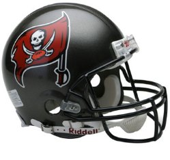
Now the Bucs’ old helmet?
Bucs Hall of Fame defensive tackle Warren Sapp has been dropping hints that there is big Bucs news coming this week. The news has arrived: the Bucs are getting a new helmet with a new twist to their logo.
It’s all spelled out at Buccaneers.com. But you’ll have to watch NFL Network on Thursday at 8 p.m. for the unveiling.
Gerald McCoy will join Sapp for the big moment.
Sapp let the helmet out of the bag, so to speak, this morning on Twitter.
@WarrenSapp: New @TBBuccaneers helmet coming for 2014! Wait til you see this thing!! #Fire my G Gerald McCoy joins me live Thurs 8pmEST @NFLNetwork.
New helmet? Hhhmmm… Joe’s not sure what is wrong with the old helmet. But, OK, fine.
Just don’t mess with the uniforms. Those are sharp. And for God’s sake don’t f’ around with anything black. The pewter pants and red/white jerseys looked sharp.
Joe has mixed feelings about this. Teams that always monkey with their uniforms (look up the definition of “uniform.” It doesn’t mean “costume.”) have garbage uniforms. Panthers and Jags spring to mind. The teams with classic uniforms (Packers, Steelers, Cowboys, Raiders, Giants) never mess with their uniforms because they don’t have to. They are classics. The Bucs had that.
No word (yet) on a uniform redesign.


February 18th, 2014 at 12:19 pm
New helmet. New logo. Chrome Grill.
We’ll see…
February 18th, 2014 at 12:20 pm
And the Bucs had a classic uni with the creamsicle! The pewter/red isn’t classic. I love it, but Bucco Bruce is the classic.
February 18th, 2014 at 12:20 pm
I am excited – to be honest I think our logo sucks pretty bad (even though our uniforms are cool). It’s far too cartoonish.
New logo, new helmet, new QB = Buccaneers become the new Seahawks
Does this mean we will get a new jersey too?
February 18th, 2014 at 12:22 pm
Chrome grill says Sapp
February 18th, 2014 at 12:22 pm
My feelings aren’t mixed. It’s a bad idea, and the Bucs are whoring themselves out to Nike in exchange for some cheap, short-term buzz. That’s one of the best uniforms and one of the most recognizable logos in the NFL , and neither should be touched at all.
But, dude, didn’t you see? CHROME. BAD ASSZZZZ!!!!!1111 /Idiots
February 18th, 2014 at 12:22 pm
Ok… Im with Joe on this one, leave the damn things alone. They were awesome the way they were.
February 18th, 2014 at 12:23 pm
Well, when I was growing up the NY Giants actually had GIANTS on the helmet.
Agreed though, no need to change a good thing from a fan standpoint. That can only mean this is a marketing ploy to boost merch dollars. Ugh!
February 18th, 2014 at 12:26 pm
Absolutely right Joe, don’t mess with the uniforms and please don’t change the logo either. It’s what’s in the inside of those uni’s that count, just concentrate on getting a franchise QB and we’re ready to roll.
February 18th, 2014 at 12:27 pm
@Pearlman, dude you took the word “cartoonish” right out of my mouth.
February 18th, 2014 at 12:28 pm
I love everything about our helmets and uniforms. I wonder if our throwbacks will be the current helmets or bucco?
February 18th, 2014 at 12:29 pm
Worst 5 Logos/Unis in the league
Carolina Panthers
Houston Texans
Miami Dolphins
Tennessee Titans
Cleveland Browns
February 18th, 2014 at 12:29 pm
I wouldn’t mind getting rid of the flag and just having the skull and crossed swords.
February 18th, 2014 at 12:32 pm
The rumor suggests a chrome grill. I wonder how this would work in the Florida sun. Hopefully it doesn’t create a blinding reflection.
I like the uniforms the way they are. I think most people would agree that a change isn’t necessary. Hopefully the powers that be didn’t overthink it. Maybe they’ll turn out to be an improvement. I’ll keep an open mind until Thurs.
February 18th, 2014 at 12:32 pm
What is it with the chrome grill? I feel like joe here – there isn’t anything wrong with our logo or uniform. On another note – it would be nice to refresh to a “new” Bucs era with Lovie leading the way. I think the Helmet will have a white base, just because that’s the only way it will match any old uniform and I really hope it is not a freaking orange base. Anyways I hope it just all works out.
February 18th, 2014 at 12:33 pm
Kind of hope they get rid of the flag and just have the skull and cutlass
February 18th, 2014 at 12:34 pm
Understand something…As we all know the NFL is a business and Owners have teams to run, so they have to do things to ignite the fan base a lil bit and switch up merchandising, of course what matters most is the product on the field and W’s but sometimes change is good and now with the fact we have a new Coach and new GM. Maybe we need to shake it up a lil bit as far as the look to get away from some of the negatives we had last year and years past. Just embrace it. GO BUCS!!!
February 18th, 2014 at 12:34 pm
I already don’t like it. I love them just the way they are. They will have to be pretty darn awesome to get me like them
February 18th, 2014 at 12:35 pm
if you google new bucs logo under images there is something someone created. Looks real nice. took the current logo and made the flag tattered and torn. Takes the cartoonish aspect out of the current logo. I like it.
I don’t want to post a link on the comments section, but feel free to google it.
February 18th, 2014 at 12:35 pm
Bobby:
First off, thanks for posting, Bobby! Honored. Best sports radio personality not on radio.
You and Joe are like-minded when it comes to uniforms. And you are absolutely right. Didn’t know of anyone whining about the helmets.
Remember how Bud Selig whored out his team by changing Brewers “uniforms” every season?
Like the word “hate,” the word “uniform” has been bastardized.
February 18th, 2014 at 12:39 pm
I read all the time, Joe, but just don’t comment very often. Of course,when it comes to something as important as the uniforms, I can no longer stand idly by.
I am sad today.
February 18th, 2014 at 12:40 pm
I’m ok with some minor tweaks, but I love our unis overall!
February 18th, 2014 at 12:40 pm
Wow, sleepy, leaky JF5 even got the old logo and uniforms fired. Now that’s impressive.
February 18th, 2014 at 12:45 pm
To Joe’s knowledge, only the helmet/logo is changing.
February 18th, 2014 at 12:45 pm
I’m keeping an open mind, but all I can think is if it’s not broken, don’t fix it. The Bucs have great uniforms.
February 18th, 2014 at 12:48 pm
NJ:
Agree with all but Browns. The Don Shula-era Dolphins uniforms were fantastic. Then, they started f’ing with the logo/colors/scheme and wrecked a good thing.
The Browns are old school NFL which Joe loves.
February 18th, 2014 at 12:49 pm
Ding!
February 18th, 2014 at 12:50 pm
Talk about wanting to move on from the train wreck of last season. New coaching staff, a new QB to at least compete with Glennon, new helmets and new uniform…couple that with Schiano being the straw that broke Cleveland’s back and cost Joe Banner and Mike Lombardi their jobs and Freeman likely playing into the termination of Leslie Frazier and last years Bucs arguably did the most damage off the field in terms of people’s careers than any other franchise. And let’s not forget the MRSA.
I just hope the helmets aren’t over the top, other than that I’ll welcome the change. Anything to fully was last years stink from this team is welcomed. It’s time for this ship to fully turnaround.
February 18th, 2014 at 12:50 pm
If I remember correctly, the last time the Bucs made an significant uniform change, not long after that, we won the SB.
February 18th, 2014 at 12:51 pm
JOE SAYS
“New helmet? Hhhmmm… Joe’s not sure what is wrong with the old helmet.”
I know the story behind this, Joe.
Because the new uniform rules the Buccaneers would have to stop using throwback uniforms. New rules say they must have the same helmets all season long.
So the new helmets are certain to have the creamcicle color combined with Pewter and Red.
February 18th, 2014 at 12:58 pm
BuccaneerBonzai:
That’s the helmet itself, not the design.
What you are describing would be like you need a new transmission so you take your car in for a new paint job.
February 18th, 2014 at 12:59 pm
It’s obvious the throwback orange jerseys sold VERY well.
White helmet makes the most sense. Throwback vs modern… all you switch out are the decals, grill and fabric. Sell more jerseys with more throwback exposure. Combine that with winning, and it’s genius. Make money hand over fist.
February 18th, 2014 at 12:59 pm
Thegregwitul:
Joe sees where you are coming from. With Joe, he sees those uniforms, and he thinks Super Bowl in San Diego, not Josh Freeman. 🙂
February 18th, 2014 at 1:00 pm
Everything Bucs I own now has to be replaced…. with that being said I hope they bring back Bucco Bruce
February 18th, 2014 at 1:01 pm
I’m a little nervous about this. I thought we had one of the cooler logos/uniforms in the league. Hopefully they’ll wow me with the unveiling.
February 18th, 2014 at 1:02 pm
I think…. I hope it’s going to be a minor change such as a meaner skull and swords.
February 18th, 2014 at 1:03 pm
Joe it sounds like you like the old uniforms. You are probably looking forward to Buc-o-Bruce to replace the skull in the logo????
tell me it isn’t so….
February 18th, 2014 at 1:03 pm
Joe Says
“BuccaneerBonzai:
That’s the helmet itself, not the design.”
I know. They will “enhance” the logo and change the helmets. Watch and see…Pewter, Red and orange will be in both logo and helmet.
And next year the new Uniforms will do the same.
February 18th, 2014 at 1:04 pm
Hope this doesn’t turn into yuc bling.
February 18th, 2014 at 1:04 pm
Maybe im reading to much into this, but on the bucs website it says the logos will be “enhanced.” When I think enhanced I don’t think radically different, so it might be the same logo but with a more modern look to it.
February 18th, 2014 at 1:05 pm
It could go something like this:
“Florida Orange” trim on the red jerseys and same on the football on the skull logo. Multiple uniform/decal combinations. Ditch the sweat-stained pewter pants. Not major change, just a tweaking- The Seahawks did the same when Nike cleaned up the contrast on their uniforms.
Fun to speculate, actually.
February 18th, 2014 at 1:05 pm
Like both, current and creamsicles.
February 18th, 2014 at 1:06 pm
I love the current uniforms but I am intrigued by this new chrome helmet and logo. I am curious if they did any market research with any current Bucs fans or season ticket holders? I had never heard of anything.
February 18th, 2014 at 1:07 pm
“Enhanced” like the Panthers enhanced their logo a few years back, i.e.: hardly any. I can see a creamsicle outline of the flag with chrome grill and some white flare on the helmet. whatever it is, i can’t imagine Sapp being too excited about them if they weren’t great.
February 18th, 2014 at 1:08 pm
Damn mitsurugi, that would be very nice actually
February 18th, 2014 at 1:08 pm
U thought Greg Schiano was gone but his influence remains see the Ritgers helmets with the chrome grills
February 18th, 2014 at 1:10 pm
Chrome grills? This makes me fear that they’ll be flirting with a black or red base on the helmet. Seems like Sapp has already seen it and approves. I’m smelling an XFL type of new look for our Bucs. Sad.
February 18th, 2014 at 1:17 pm
We need to ditch the pewter helmets. They look like crap anyways. White helmets. Please.
February 18th, 2014 at 1:17 pm
I just bought some dam jerseys!! They better not change the unis!!
February 18th, 2014 at 1:19 pm
http://www.flickr.com/photos/fourteen85/7117685575/in/photostream/
Found this, these don’t look bad, but who knows if this is it or close. It still uses the old logos in a different way.
February 18th, 2014 at 1:21 pm
I will be open minded and reserve my opinion until I actually see what it looks like.
February 18th, 2014 at 1:22 pm
Pewter pants need to go
February 18th, 2014 at 1:22 pm
I’m thinking they are going to be White based so they can wear the throw back uniforms. Maybe?
February 18th, 2014 at 1:22 pm
change is good.
February 18th, 2014 at 1:23 pm
Those are not the new helmets or even close. And don’t believe the “chrome” rumors either.
February 18th, 2014 at 1:23 pm
The pewter sucks. It’s almost a neutered color. The pants are ugly. Go back to orange and white. Soooo cool. Pewter pants showcase piss stains
February 18th, 2014 at 1:25 pm
New coaches, new logo, new QB? Just watched 22min highlights of Manziel on youtube. It’s like if Barry Sanders played as a QB!
I’m so confused about what to do in the draft! LOL!
February 18th, 2014 at 1:27 pm
Better not be like the Dollphins new helmet! They have GOT to be embarrassed about that “diverse” Dolphin now.
February 18th, 2014 at 1:27 pm
Agree… ditch the sweat soaked pewter pants too.
I’m going to predict it now… white helmets. That way, we’ll be able to wear the white Bucco Bruce helmets too with just a few decal changes.
February 18th, 2014 at 1:28 pm
I wonder when the non-profit NFL is going to create a subsidiary of the NFL Network – the NFL Jersey and Helmet Network?
Man, the lengths that network goes to keep former NFLers like Sapp employed never ceases to amaze!
February 18th, 2014 at 1:28 pm
I like the pewter.
February 18th, 2014 at 1:28 pm
Oh, Joe, believe me, when I look at the current helmets I also see San Diego, along with Ronde’s pick-six against Philly, and Joe Jurevicius and his crazy run after the catch, and Derrick Brooks and Sapp, heck even Shaun King and Warrick Dunn in that incredible MNF game against the Rams.
While I’m sure ownership would have eventually introduced some kind of change to the helmet/uniform down the road, I really think the shame and stink of the Schiano sh*t-show turned this into a priority. Plus, look at the merchandise / money making opportunity coming up for the team.
In any event I hope for the best and I’m glad that I bought a Doug Martin throwback last year and held off on the Lavonte David jersey this season.
February 18th, 2014 at 1:30 pm
There’s NO way this doesn’t get leaked before Thursday night.
IMPOSSIBLE.
February 18th, 2014 at 1:30 pm
I suspect we may see creamsicle orange make its way back into the mix.
Love the pewter in helmets and pants. Hope that stays
February 18th, 2014 at 1:44 pm
i dont like it we have prolly the best uni in the league and best helmet i wouldnt touch it
February 18th, 2014 at 1:44 pm
95% of the people complaining are the ones that spent money on bucs gear.. And now that the logo is going away, you have to buy new gear. Or you are forced to be left with old sh** …lol stop being cheap
February 18th, 2014 at 1:46 pm
I don’t care if they wear tutus and bras on their heads as long as they find a QB and win some Fn games
February 18th, 2014 at 1:53 pm
Nothing wrong with what we have now! Main colors and accent colors are the best. Only thing I would like better with current scheme is white pants with the red shirt. Sapp seems to be jacked about it, and he loves the current colors, so I’m a little intrigued. Just tweaks please! No major changes!
February 18th, 2014 at 1:53 pm
With the heat in tampa we need a uni that reflects the sun as much as possible. White helmets same logo, chrome helmets same logo it doesn’t matter just as long as its cooler for our players.
That Tampa heat turns you 3 shades darker then normal.
February 18th, 2014 at 1:54 pm
Maybe… just maybe… they are updating the helmet design to be more workable with the throwback uniforms??? That’s the only justifiable reason I can see. I really missed the throwback game this year.
February 18th, 2014 at 1:55 pm
TJ Ware,
You are correct. 5 years or so ago, I bought new Lightning crap for me and my kids, and the next year they drastically changed the logo. Since then, i stick to stuff that is $15 or less.
February 18th, 2014 at 2:17 pm
Rumor has it the helmets will have a straight on picture of Tim Tebow on it smiling…
February 18th, 2014 at 2:24 pm
This sucks
February 18th, 2014 at 2:55 pm
Still like the 76 version the best.
February 18th, 2014 at 2:56 pm
Wonder if it’s because the Raiders had a hissy that we “copied” their logo….which is a joke!!!
February 18th, 2014 at 3:06 pm
Joe,
By”need a new Transmission”,
Were you referring to replacing Glennon with Johnny football?
Seemed pretty clear to me- just wanted a verification, to help out the Glennon Mob. They seem to struggle with inferred meanings!
Lol
February 18th, 2014 at 3:15 pm
In my gravatar I have captured the new “Clowney” logo.
They will pay me a modest licensing fee.
Carbon fiber helmets, chrome face masks and reflective shades.
Their future is so bright, you’ll have to wear shades.
February 18th, 2014 at 3:17 pm
I personally love the current look of the helmet and uniforms, but im also always up for change. Everyone changes them eventually and with what college does with their uniforms is awesome. I buy a jersey every year and they could change that too and it wouldn’t upset me in the least.
February 18th, 2014 at 3:22 pm
I’ve been fine with the uniforms as well but the more that I talk to people outside of town/not emotionally tied to the team, they think we have one of the worst looking uniforms. They can’t tell the difference between the pewter pants and brown. We have been a really bad team for the past decade+, maybe a mix up wouldn’t be bad. Helped the Seahawks….
February 18th, 2014 at 3:28 pm
Reminds me of these. I like this and it would work with the Retro uniforms.
http://cdn.fansided.com/wp-content/blogs.dir/50/files/2010/11/bucsnike.png
February 18th, 2014 at 3:35 pm
Who cares if you have the old jersey or old logos?
Is that really a big deal?
People are so weird.
If the Bucs get a new logo, I still won’t be buying anything new anytime soon.
February 18th, 2014 at 4:13 pm
I feel like its going to be an alternate logo/helmet type thing.
Since they aren’t allowed to use the clreamsicle anymore it’s probably going to be some type of helmet to wear once a year on special occasions thats why they didn’t say anything about changing the actual uniforms.
I think they would have made a bigger deal of it if it was a complete overhaul.
February 18th, 2014 at 4:45 pm
It makes sense if it’s just a minor tweeking of the current helmet. Not much, if anything has been said about changing the uniforms themselves. If it was a major change, I would think a big unveiling would be scheduled at One Buc with players modeling the new threads. The fact that it’s Sapp unveiling the new helmet on NFLN at 8pm on a Thurs. tells me it’s not that major.
February 18th, 2014 at 4:46 pm
I like the pewter helmet and uniform pants also. Best look is pewter pants and red jersey,IMO. I liked the Bucco Bruce outfit too. Minor tweaks will be OK. If the Bucs won the SB with a changed uniform just keep the pewter that was part of the last change.
February 18th, 2014 at 4:52 pm
Please no iridescent color change crap and no airline logo. I’m pretty nervous about this. The white helmet thing would be cool though.
February 18th, 2014 at 4:59 pm
A stripe would be cool. I’d really like my team to have a clean, classic look, not the flavor of the month.
February 18th, 2014 at 5:36 pm
No more pewter sweat stained, piss soaked, stinking, frothing, disgusting, dog feces colored pants…
February 18th, 2014 at 5:53 pm
Its already been announced by the bucs that they are NOT going to make any significant changes to the bucs uniforms. Just logo and helmet people! I also wouldn’t mind seeing those pewter pants changed, maybe black, but its not going to happen.
February 18th, 2014 at 6:06 pm
Is this the sign of change, London, mmmm
February 18th, 2014 at 6:09 pm
I had a feeling this was coming when every item in the official team store was 50% off from November on including jerseys.
February 18th, 2014 at 6:22 pm
We’ve already had the title of worst logo and uniforms, i love the idea that when we look at our now old uniforms to point to the garbage put on the field it will be forever associated with mark dominick and greg schiano and now with a new look and new coach and new year we can see upgrades from front office all the way down to uniforms and since it’s been in the works for two years i love the timing
everyone feels just alittle better when wearing a new outfit even simple jeans and tshirt so anything that might give the players a boost in confidence and swag im all for it
February 18th, 2014 at 6:40 pm
“it will be forever associated with mark dominick and greg schiano ”
Yeah because no one wold ever associate those uni’s with something like… oh i don’t know winning a Super Bowl or anything like that.
February 18th, 2014 at 6:47 pm
the uniforms didnt win the superbowl….and yes it was a great year…..ONE YEAR ummm i dont know about you but some teams have been in the playoff race to the superbowl every year and we’ve got that one year over 10 years ago thanks to players who are retired so hold on to that logo if you want, warren sapp is a hall of famer no matter the logo, guess theres something wrong with wanting a change…or are you tired of buying jerseys of players who cant stay on the team long enough to matter
February 18th, 2014 at 6:55 pm
A chrome grill would be a mistake functionally. You wouldn’t be able to see anything with all the sun glare in your eyes.
February 18th, 2014 at 6:58 pm
Why would anyone want to go back to Bucco Bruce? Then we’re definitely gonna be losing.
February 18th, 2014 at 6:59 pm
I hope they put the carbon fiber design in the helmet. It looks bad Azz and already matches the pewter tone. I don’t like how we wear the all white uniforms, they look like surrender flags from our pirate ship. But Carbon Fiber helmets would look pretty cool with a chrome grill!!!!!!!!!!!!!!!!!!!!
February 18th, 2014 at 7:04 pm
Just please do not do what the Marlins did to their uniforms.
February 18th, 2014 at 7:16 pm
gotta admit im nervous about the change too because it’s not like hiring greg schiano….were gonna be stuck with it for awhile and if this decided it’s time to unveil the change it means the owners love it since their paying for it and they cant take it back once its unveiled. it took new owners to make a change to the pewter which i loved so lets hope the glazer boys have some kind of style because their dad spearheaded pewter
February 18th, 2014 at 7:58 pm
As long as they don’t make them look as bad as the Dolphins and Jags did when they changed theirs last season. I like ’em the way the are.
February 18th, 2014 at 8:02 pm
I’m sure it has something to do with not being able to wear our throwbacks last year, just chill out and wait about 49 more hours, I’m sure it will be a sharp looking piece
February 18th, 2014 at 8:07 pm
I didn’t think about that….the whole throwback helmet thing. That tells you the helmets will be white. Hmmmmmmmm……..Not sure I like that idea. Hope they know what they’re doing. The Jaguars helmets are the dumbest things I’ve ever seen.
February 18th, 2014 at 8:16 pm
White helmets would look horrible with pewter and red!
February 18th, 2014 at 8:32 pm
Make the pants white and leave the rest alone.
February 18th, 2014 at 9:10 pm
PEOPLE! READ! They said logo and helmet ONLY. The jerseys and pants are staying the same, Glazers love the pewter, have said it before. LOGO AND HELMET ONLY!
February 18th, 2014 at 9:37 pm
Making the skull more fierce would be cool. But bringing back Zorro the Winking Gay-Blade would be awful.
February 19th, 2014 at 12:04 am
I would assume that the change will be something similar to like what the Vikings did last year. Yeah, that’s right. The Minnesota Vikings changed their logo. Very subtle changes, that went a long way. The new Vikings logo is cleaner, and made the design more of a square type logo instead of being dominantly vertical.
I am assuming that the Bucs stay with the logo they have now, (not go back to bucco bruce) but just make shrink it up a bit to make it square, instead of the horizontal style that it is today.
If they go back to Bucco Bruce, then that’d be great either way. I hope the Bucs don’t screw this up. Im a huge Viking and Bucs fan so this would be awesome if they did the right changes. Very surprised there have been no leaks on this, which is convincing me that the changes are very subtle as far as the logo goes.
February 19th, 2014 at 8:51 am
Contrary to popular belief, the pirate is not “winking,” the sun is in his face and he’s biting into the sword. He has one eye closed. That logo was/is the best in football…
February 19th, 2014 at 10:17 am
You’re going to see a while helmet with the skull and swords ENLARGED ON EACH SIDE with a stripe similar to the pants stripe.
February 19th, 2014 at 1:05 pm
I think that the “Grill” will be a Red Chrome and that Red Chrome will “Bleed” onto the Helmet, giving the look of a Flowing Flag. I would imagine the Helmet would still have a Pewter Color but with a Mat Finish like the Vikings. I also believe that there will be an Orange Trim to the Flag that makes the Orange really Pop…. much like the Lime in Seattle’s Uniform. Just an Opinion of course.
February 19th, 2014 at 2:33 pm
Check your facts Joe, the Panthers have NEVER changed their uniforms – they only changed (updated) the logo and added an alternate blue jersey and alternate black pants.
February 19th, 2014 at 4:30 pm
I hear it will be roger goodell with an eye patch, do rag, and holding a knife against the logo of the nfl shield.
February 19th, 2014 at 6:36 pm
I guess I was the minority. I always liked the flag and Bruce. Love the red jerseys but pewter looks a lot better on a helmet than on cloth. Ditch the pewter pants. Helmet will probably be white so throwbacks can be worn. Primary logo gets tweaked in an update but primarily remains the same. Number font changes to a pirate font? Pants show up in a new red. Just a few guesses.
February 19th, 2014 at 10:36 pm
Remember I said Rutgers, one of the samples looks a lot like Rutgers