


Here Is Your Bucs’ New Red Jersey
March 3rd, 2014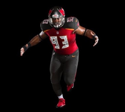
Photo courtesy of the Tampa Bay Buccaneers.
Well, these are better than the white jerseys unveiled this morning. Personally, Joe doesn’t like multi-colored jerseys with different color shoulders. Screams “CFL.” Joe really liked the classic look of the original pewter and red uniforms. No need to fix what wasn’t broken. But given that NIKE had its fingers involved, it could be a whole lot worse. About the only team NIKE hasn’t messed with once they got a team contract was Penn State’s beautiful uniforms.
Thankfully, the Bucs didn’t pull a stunt with black jerseys (yick!). Joe has no idea why people are fascinated with black jerseys. If everyone had black jerseys, then what would be the point? Let the Raiders have their black.


March 3rd, 2014 at 3:25 pm
Much better
March 3rd, 2014 at 3:25 pm
http://www.buccaneers.com/multimedia/photo-gallery/Photos-New-Uniforms-Unveiled/1c5981a2-ef8c-4acb-849d-11be03e8f8df#40923096-bed8-492a-aff3-d9486f5e6475
That is the Bucs full photo gallery slide show of the Bucs uni’s and if you go towards the end you’ll see the pewter stand out a lot more.
March 3rd, 2014 at 3:26 pm
Not bad
March 3rd, 2014 at 3:27 pm
MUCH better.
March 3rd, 2014 at 3:27 pm
When the Bucs enter the red zone, they won’t fire cannons, they will play the signature ‘beep’ soundtrack from 24.
March 3rd, 2014 at 3:30 pm
Those new uni’s should be real comfortable for those 1:00 games. Brilliant!
March 3rd, 2014 at 3:30 pm
Have you actually looked at a CFL jersey Joe? Most of them are more old school and classier than NFL jerseys.
March 3rd, 2014 at 3:32 pm
I guess we will be drafting Willie Beamon! We should have hired Leee Corso and changed the team name to the tropics.
March 3rd, 2014 at 3:32 pm
24…So Darrelle Revis IS Jack Bauer!!
I like the uni’s, and frankly, as long as they win I don’t care.
I’ll buy a jersey anyway.
March 3rd, 2014 at 3:33 pm
Is there a built in alarm clock on those jerseys too? Fits with the number scheme…
March 3rd, 2014 at 3:34 pm
Cool!
March 3rd, 2014 at 3:35 pm
The lettering for the names is epic.
March 3rd, 2014 at 3:35 pm
The number shapes look awful. Incoming players: hope you don’t get a nine or a six in your number. Ugh.
March 3rd, 2014 at 3:36 pm
Better…..but still ugly
March 3rd, 2014 at 3:36 pm
Nope. These new uniforms are crimestopper uniforms. The white jersey looks like the A-Team van and the numbers are from 24.
In other words, if you screw with the Bucs, you have to deal with both Mr. T and Jack Bauer.
March 3rd, 2014 at 3:36 pm
Now that I like!
March 3rd, 2014 at 3:36 pm
i think they look hype. love them. out with the old, in with the new.
Much like our roster will be in a few days…..
March 3rd, 2014 at 3:38 pm
Or a four. Ugh.
I prefer the white jersey. I just have to be careful about the number I put on it.
March 3rd, 2014 at 3:40 pm
Only one color for pants?
March 3rd, 2014 at 3:41 pm
I think if we don’t score in the 2 min drill, the ship blows up.
March 3rd, 2014 at 3:44 pm
Numbers are HIDEOUS. Sock tops should be red and DROP the orange. Other than that they aren’t too bad. don’t like the two-toned jerseys though. #NikeSucks
March 3rd, 2014 at 3:44 pm
That equates to two years of research????
I guess the Glazer clowns ( Joel, Ed, Bryan ) decided if we can’t produce a winning football team then we will try to generate revenue with new uni’s…oops, they screwed that up too!
March 3rd, 2014 at 3:45 pm
They have three different sock colors to choose from.
“The Buccaneers will also have the option of wearing red, pewter or orange socks to create distinct looks.” via @TBBuccaneers
March 3rd, 2014 at 3:46 pm
Those numbers tho…..maybe they will “wake up” the Bucs offense?
March 3rd, 2014 at 3:46 pm
Nope they didn’t 😉
March 3rd, 2014 at 3:46 pm
Sammy Watkins is gonna look great in this jersey
March 3rd, 2014 at 3:47 pm
@Joe watch out for Darrelle Revis then 😉
March 3rd, 2014 at 3:47 pm
looks like a Disney designed.
March 3rd, 2014 at 3:48 pm
I think the alternate will be orange
March 3rd, 2014 at 3:49 pm
the titans already have the crappy number font and different colored shoulder thing; they look bad on them too!
the red sock version does look better though.
March 3rd, 2014 at 3:50 pm
Yeah, wonder what they would’ve looked like had Reebok made the unis.
March 3rd, 2014 at 3:51 pm
Does this mean Joe Buccs fan gets a new logo change??
March 3rd, 2014 at 3:53 pm
No. Joe’s logo is iconic. Much like Penn State’s uniforms. Or Alabama’s. Or Florida State’s.
March 3rd, 2014 at 3:56 pm
Pure MONEY GRAB to sell new gear!! You sure can’t miss that bright orange NIKE logo. May as well add a few more logos and turn them into soccer jerseys.
Hope that the Glazers at least take some of this money and upgrade the stadium food and Game Day experience. Video monitors at both ends of Raymond James are way too small for replay review.
March 3rd, 2014 at 3:58 pm
Wake up the offense! LOL
March 3rd, 2014 at 4:03 pm
@PRBucFan
Thanks for putting that link up the jerseys pretty good in my opinion as long as it comes out like that
March 3rd, 2014 at 4:05 pm
Np, and yea I totally agree.
March 3rd, 2014 at 4:06 pm
Ugh. Hate em. LOVED the pewter and red. No need to change. Kind of looks like we’re trying to be Falcons South, but maybe my colorblind is acting up?
March 3rd, 2014 at 4:09 pm
laughing stock
March 3rd, 2014 at 4:10 pm
Uni won’t change my loyalty or fanhood one bit. Didn’t like the idea of changing, but what’s done is done. I’ll still cheer every week. I may even buy a jersey.
Which brings me to… I think a lot of the changes by Nike, like adding reflective chrome around the numbers is to discourage fakes or at least make them more difficult to replicate. Chinese knockoffs were pretty decent and cheap.
March 3rd, 2014 at 4:10 pm
Hideous.
March 3rd, 2014 at 4:11 pm
I like the orange streak and the letters, but get rid of pewter on the shoulders
March 3rd, 2014 at 4:12 pm
Can we win a championship with the fourth worst uniform in the division?
This s*cks out loud. I was excitied to see the new logo (which also blows) so I could get cheap gear with the old logo.
Now I think I’ll just become a closet fan that listens to games on the Radio for the next 10 years so I don’t have to watch that crap.
March 3rd, 2014 at 4:12 pm
Reduce the size of the flag on helmet or get rid of flag altogether and keep the skull
March 3rd, 2014 at 4:14 pm
Do something with the pants and fast.
March 3rd, 2014 at 4:16 pm
“Joe – No. Joe’s logo is iconic. Much like Penn State’s uniforms. Or Alabama’s. Or Florida State’s.”
Even if Nike offers a nice contract? haha
March 3rd, 2014 at 4:18 pm
The only thing I like is the new pirate ship.
And, I’m just being some grumpy old man. I remember when they retired the creamsicles for the red and pewter, and I loved them!! These just blow.
March 3rd, 2014 at 4:20 pm
Now these look really good.
March 3rd, 2014 at 4:20 pm
Only if they buy Joe out.
March 3rd, 2014 at 4:21 pm
These are futuristic. It’s a new world out there.
March 3rd, 2014 at 4:33 pm
The uniforms look better in the pics on the Bucs website… However, they are still pretty ugly. I think it’s the little patches of orange at the shoulders. It just throws the whole thing off. It doesn’t match with the new colors at all. It will have to grow on me, but I am still disappointed it took them 2 years to come up with a design that is worse than the uniform before. I think anyone was saying that the last time they changed the unis.
March 3rd, 2014 at 4:33 pm
The panties units were always going to be hard to beat there blue’s are very very nice but with the latter pics in that slideshow you could see that it was pewter not black and they look sick, numbers or not lol.
March 3rd, 2014 at 4:34 pm
It does match our traditional colors and the football on the helmet is the exact same orange.
Look for an orange alternate jersey lol
March 3rd, 2014 at 4:38 pm
There I like more than the white.
PRBucFan, thanks for the link. It set my mind at ease. It is Pewter.
Now, I like everything BUT those butt-ugly numbers 😉
March 3rd, 2014 at 4:39 pm
Yey!!! 😀
Mission accomplished ahaha
March 3rd, 2014 at 4:39 pm
Whoever did the photography for these uniforms did a terrible job. Some pictures make the uniform look black, while others look pewter. First of all, don’t shoot on a black background geniuses!! It’s going to make everything look darker. Second, if you are going to, expose properly. Finally, expose all the shots the same if you are using the same background! Pretty simple, and I’m really shocked how they couldn’t have found a better photographer.
March 3rd, 2014 at 4:39 pm
their* not there lol
March 3rd, 2014 at 4:42 pm
Joe Says
Does this mean Joe Buccs fan gets a new logo change??
“No. Joe’s logo is iconic. Much like Penn State’s uniforms. Or Alabama’s. Or Florida State’s.”
Joe, you could put a “Joe” on the other side (right side) in the new uniform 😉
March 3rd, 2014 at 4:51 pm
Insanely bad color scheme along with crappy design.
March 3rd, 2014 at 4:53 pm
Malcolm Glazer was great. His three sons have run this team into the ground ever since he got sick. Any more surprises Ed, Brian and Joel?
March 3rd, 2014 at 4:59 pm
Haters are gonna hate
That won’t ever change lol
March 3rd, 2014 at 5:27 pm
The unis are dumb. McCoy looks like a fat slow cow. That’s hard to pull off on a still pic. Especially him. He’s a pretty lean dude.
March 3rd, 2014 at 5:30 pm
Negative Ghost Rider
March 3rd, 2014 at 5:34 pm
Are these the new Burger King employee uniforms or the Bucs?
March 3rd, 2014 at 5:40 pm
Those people who don’t like the uniform are those people who aren’t prepared to get with the times. Hats off to Nike for taking a risk. When we’re seeing these in their full glory in our first game you’ll all realise just how great they are. The red is awesome!
March 3rd, 2014 at 5:41 pm
If these unis came immediately after the Creamsicles, I would probably love them. It’s kind of like having a pile of dirt and someone swaps you some silver for it. AWESOME! But then when you have gold and someone swaps you silver, you get your panties in a wad.
My panties are in such a wad, I think my elastic waste band broke.
March 3rd, 2014 at 5:51 pm
As long as all of the “PEWTER” on the new uni’s both home and away actually match the helmet “pewter” than I am happy to have the new look. But if they run out on the field every game having helmets that look nothing like the rest of the uniform than is it a complete failure. Guess we’ll see when the time comes.
March 3rd, 2014 at 5:56 pm
Hope the Bucs win a lotta games cuz if not none will be buying these things. I won’t even THINK about getting one until 2015. See if we win some games and if they grow on me. I could have designed a better uniform after a night at the bar, but I will try and remain open minded until I see some better pictures or see them up close. Right off the bat the photographer needs to be fired. They’re name should be put on the photo’s so nobody accidentally hires them for an event.
March 3rd, 2014 at 6:04 pm
PrBucFan might be the only person I’ve seen who absolutely loves these things. I hope he’s not representative of the whole fanbase, because if these tank badly enough in sales the pewter and red will be back before you know it.
Seriously though, they bypassed going back to creamsicles for something worse? Mind boggling….
March 3rd, 2014 at 6:10 pm
I dont even think Johnny Football can make this uniform look good
March 3rd, 2014 at 6:16 pm
I might get one when they change the number font. The nod to the orange is big for me, though. As a long-time fan, I appreciate it. And I hope they don’t give in to the squeals of the younger metro-types and ditch it.
March 3rd, 2014 at 6:43 pm
The flag size on the helmet is way too damn big. Downsize it! I just saw the uni’s on the tv news, still don’t like them, but it does’nt matter, it is what it is. I have never worn any team’s gear, no free advertising here, my money is spent on things that have real value. That said, I love the Bucs and will always love my hometown team.
March 3rd, 2014 at 6:51 pm
What are “younger metro-types”?
March 3rd, 2014 at 6:53 pm
Sorry folks. New unis suck ass. Hope we can score some points and win some games.
March 3rd, 2014 at 7:08 pm
Why go with ‘timeless’ when you can put a clock on each jersey?
March 3rd, 2014 at 7:20 pm
hideous and just all out crappy looking…I”ll be hanging onto my old ones…smdh! wth is going on with the digital numbers?
March 3rd, 2014 at 7:22 pm
I think they look alright, not totally impressed, but my kids all think they are great. Maybe that is what the Buc’s brass is trying to impress the younger generation. I rout for the team not the uniform. My biggest dislike are the numbers, I will say I think this will grow on me, it will really grow if the team starts winning with regularity.
March 3rd, 2014 at 7:36 pm
Horrible !!! Horrible !!!
Are we the Chiefs, Browns or Falcons ? Change just 1 small color and we could be anyone of those teams, can you do that with new Dolphin uniforms ? Speaking of Dolphins they have white uniforms for home games, wonder why, probably because it HOT in Florida !
When I see U. Oregon uniforms in 2 seconds I can say that looks nice. Buc uniforms I’ve been looking at it all afternoon, still ugly !
Face mask is not crome, put Oregon face mask next to Bucs you can see big difference
March 3rd, 2014 at 7:59 pm
Nothing distinctive or classy about these compared to the pewters they’re replacing.
Figures I guess, checkers sells better than chess.
Rest assured I won’t be buying any of these. Rays/Bandits/Bulls/Lightning/Storm give a lot of better alternatives.
If I wanted Atlanta Falcons merchandise I’d already own it thanks.
March 3rd, 2014 at 8:56 pm
Changing the uniform in my opinion, is going to equal bad juju. I mean last season was bad enough without anymore ludacris moves made to the Bucs organization. The uniforms should be the least of their worries. I mean, lets set our sights on a Great QB and an Offensive Coordinator that can actually get us to score. Lovie is going to be a great asset of course, (however we NEED to worry about players, Not Uniforms that look like someone tried to knock off the Falcons/Seahawks uniforms… REALLY Bucs organization, Really??? For Shame!!!
March 3rd, 2014 at 9:11 pm
@PRBucFan – those pictures you posted a link to look much better than these renderings. The Bucs shouldve posted actual photos and not the renderings.
March 3rd, 2014 at 9:31 pm
Horrible uniforms.
March 3rd, 2014 at 9:49 pm
Much better! Where’s that chrome face mask!?
March 3rd, 2014 at 9:56 pm
I can tell you for a fact I will not spend any money on these uniforms.
March 3rd, 2014 at 9:59 pm
Dnt love or hate them..I will reserve judgement til the sunday night lights hit them..or the sun lol
March 3rd, 2014 at 10:00 pm
looking at these pictures, you’d think the color of the pants and shoulder pads are black but its not. Its more of a dark shade of pewter, which looks much better. scroll through these pictures and you will notice its pewter.
http://nfl.si.com/2014/03/03/new-tampa-bay-buccaneers-uniforms/
March 3rd, 2014 at 10:16 pm
Would like the numbers to be orange
March 3rd, 2014 at 10:17 pm
If they win consistently, these will the most beautiful uniforms in world…and everyone will be buying them.
March 3rd, 2014 at 10:23 pm
Wow those are ugly! Went from one of the best in the league to that mess. What a shame!
March 3rd, 2014 at 10:51 pm
I think the heat is the least of their worries.Enough of that.
March 3rd, 2014 at 10:57 pm
A little better than the away uniform. It’s a done deal, so I guess I’ll learn to accept the new look.
March 3rd, 2014 at 11:26 pm
Best pictures of the new unis I’ve seen yet! McCoy looks awesome! Enjoy!
http://www.myfoxtampabay.com/story/24869521/2014/03/03/buccaneers-new-uniforms-get-mixed-reaction
March 3rd, 2014 at 11:29 pm
Keep the bitching coming lol
That’s one if the few things our fanbase is phenomenal at Ahahahaha
And plenty of people like them.
If you haven’t realized by now just like the helmet rendering that looked black but in reality was pewter the same damn thing happened with the uni. The pants and the jersey are pewter NOT black.
Get over it because there’s is zero you can do about it.
Except cry I guess… Ahahahaha
March 4th, 2014 at 12:05 am
There is something that can be done. Don’t buy this garbage merchandise.
March 4th, 2014 at 12:32 am
The colors would be ok I suppose but what’s with the weird looking numbers?
March 4th, 2014 at 1:22 am
Man, all these so called fans do is Bitch! The biggest bunch of whiny ass grown men I’ve never met in my life. We changed! Get over it! Its done! I for one really like em, I think there gonna look even better on game days. If you don’t like it, go find a new team too complain about. Smdh
March 4th, 2014 at 7:12 am
Hideous
March 4th, 2014 at 8:24 am
I can’t believe how bad these uniforms are. The orange trim sticks out like a sor(er) thumb.
Bucs should reconsider and go back to the classic uniforms of last year
March 4th, 2014 at 8:27 am
Sorry guys. We forgot to check with you before we dared to have an opinion of our own. Didn’t realize we had to love everything YOUR team does. I wonder what it feels like to love every move this team has made the last 7 years. Boy that 4-12 must made you all giddy. And that start of 0-8 must’ve given you huge ragers. Or is it just in hindsight we can not like something? But since we are not communists, I chose to have my very own opinion. And if you don’t like it, feel free to have sex with yourself on your to home to mother Russia.
March 4th, 2014 at 10:00 am
The uniform is awesome. I love the Orange. The biggest problem is the photos are all skewed as the pewter looks black.
If you see pics with light involved you’ll see they look great. I put two good ones on my site.
March 4th, 2014 at 2:39 pm
Oh we knew the bitching would occur regardless, we are just calling a spade a spade. Which is our opinion too 😉
Don’t forget the tissues on your way out.
Cryless
March 4th, 2014 at 3:42 pm
Not one change they have made have I liked. It is really amazing how poorly conceived this uniform change was and how well the 1997 uniform change was made. The shoulders look black. I can’t imagine any fan wanting to sit with black/dark pewter shoulders in a jersey or any other team gear carrying that color scheme. Do they talk to people who go to the games? The “BUCS” lettering on the left shoulder is really poor. And the numbering is the worst. It as if Vince Naimoli came back and created these multi-colored nightmares.
March 5th, 2014 at 7:03 pm
@Chef Paul
Sour grapes. Jeez you guys. “I don’t like them, Wa Wa WAAAA. ” ” I won’t buy them” Who cares? They’ll sell. Not buying them by so called fans won’t change shit. Guess what? You don’t get a vote. Never did, never will.” Support your fricken team!!!!!
March 7th, 2014 at 8:37 am
They’re hot garbage. You can say it. They look ridiculous. You can say it. They look like someone left their 5-year old alone on Madden create-a-uniform, came back and were like “HELL yeah”. You can say it. The designer and whoever it was at OBP who authorized this clusterf**k of a uniform should be horse-whipped then forcibly sodomized with a chainsaw at the 50-yard line of Raymond James Stadium. You can say it.
You can also say “OMGF, SERPER!!! NIKE LOVES US AND WEER AWSUM”, and I will immediately ignore anything you have to say from this point forward. The new uniforms (not a single bad word will be said about the new helmets, I freaking LOVE the helmets) are absolutely horrible. You can say it, it’s okay.